When it comes to signs, it can sometimes feel like people are speaking a foreign language. There are hundreds of terms that are specific to the design and manufacturing process of signage.
Because we know how confusing it can be, here is a range of some of the critical sign terminology. It will cover everything from the different elements of signs to a few key types of signage.
Acrylic
This is a sturdy and durable plastic that manufacturers use to make signs. This colored, clear, or frosted material is often called plexiglass. It is a fantastic alternative to glass because it is lightweight and shatter-resistant.
Aesthetics
Aesthetics refers to perceptions of an object’s beauty and taste. Your signage needs to have some artistic appeal. Several elements play into this like the material, design, color, construction, the form of the sign. But the complete picture that these aspects create is critical.
Aluminum
This is another material that is commonly used to design signs. Sign makers use it because it is lightweight yet durable and resistant to corrosion and rust. Besides this, they can use it to manufacture the poles and frames for certain signs.
Aspect ratio
The next term applies to digital signs and advertisements. Aspect ratio is the width-to-height ratio or proportion of an image. For example, most high definition television screens have a proportion of 1.78:1.
Animated sign
These are signs which represent action or motion. Manufacturers usually create this depiction through changes in colors or light. The graphics and images are generally more central in these types of signage.
Awning sign
You will typically find these on storefronts. Manufacturers usually construct them from some type of heavy fabric which they drape over a metal frame. These project over the entrance or facade. You can print words or graphics on them, while also using it as a covering over your storefront.
Backlighting
A backlit sign is a sign which is lit from behind. Professionals usually do this by projecting light onto a surface behind the object. This creates a halo effect. You can choose between a variety of backlit signs like letters or awnings. They are best if you want to draw attention at night.
Banner
This product is a sign that is made of fabric and draped over a framework. Importantly, you can buy these in a variety of designs. Some of them are made to hang off buildings or structures, and others are freestanding.
Border
You can use this phrase to talk about the physical edges of the sign. Or you can use it to describe the outline in the form of a line or band of color around the signs’ contents.
CMYK
This one sounds pretty complicated. But don’t worry, it’s quite simple. CMYK is an abbreviation for cyan, magenta, yellow and black. It is one of the color profiles that are used by printers. You can use these shades to create a full spectrum of colors.
Copy
You can’t discuss sign terminology without discussing copy. The phrase is used to refer to all the words on a sign. This is the entire body of text from the business’ name to persuasive phrases.
Coroplast
An alternative for this term is corrugated plastic. It is a plastic which resembles cardboard. The benefits of this material are that it is inexpensive and light, but still sturdy. Sign makers generally use it to produce temporary signs like yard signs.
Cost per thousand
CPM is the cost necessary to bring a message to a thousand people. Marketers calculate this by dividing the money needed to produce one sign by the number of viewers who would see it. You can use this concept to help you find the most cost-effective signage solution for you.
Contrast
The relative difference or variance in the hue, intensity, and saturation of different colors. Higher contrast signs are much easier to read than lower-contrast signs. Your audience will be better able to make out the individual elements.
Electronic message board
A board with LED lights that can be used to display computer-generated messages or graphics. Most of the times, you need to mount them on another sign like a monument sign.
Engraved signs
Engraving is a technique which you can use to cut or curve a text or graphic onto a hard surface. Manufacturers can do this on a variety of materials like wood, plastic, or aluminum. You can use this to create a 3D effect on the sign.
Finishes
The finish is the coating that sign makers can apply to a sign. Most of them are formulated to protect its surface. For example, there are finishes which you can choose for extra weather resistance. Others are purely aesthetic.
Font
Font, or the typeface, is a set of letters, punctuation marks, and numbers which conform to specific design standards. For example, Gothic, Helvetica, and Times New Roman. The font can affect the sign’s visibility, readability, and aesthetics.
Freestanding sign
Many signage products need to be mounted on a pole or structure like a building. But others are freestanding. This means that the manufacturers designed and constructed them to stand on their own. For example, monument signs and A-frame sidewalk signs.
Incandescent bulb
These are bulbs that are vacuum-sealed and contain a wire filament. When an electrical current passes through it, it lights up. They are often used in households but can also be used in signage.
Interior sign

Signage products are constructed for specific purposes to be used in particular places. Interior signs are made to be placed indoors. For example, menu boards, lobby signs, and wall wraps.
JPEG
The letters stand for Joint Photographic Experts Group. This is quite the mouthful. To put it simply, it is one of the most common formats for colored digital images. To decrease the size of the file, a jpeg can be compressed. In the process, the image loses some of its sharpness.
LED
The abbreviation refers to a light-emitting diode. It is basically a device which emits light when an electrical current is passed through it. They are extremely energy efficient. Experts can attach them to computer arrays to create changing video like displays. LED signs are perfect for getting attention and displaying information at night.
Legibility
Overall, the legibility of a sign refers to how easy it is to read and to make out. You will find that this depends on several factors. The most crucial are the typeface, size, colors, contrast, spacing, and view distance.
Lettering
In this case, the term is used to describe the various letters that are used in signage. You will generally use them to spell out your company’s name. There are many different types available like channel letters, dimensional letters, or backlight letters.
Logo
Logos are a name or symbol which represents a business, service, or product. It should be unique and visually distinctive. Your logo is vital to your branding. That is why you will probably want to incorporate it in some way on your sign.
Frontage
The frontage is the facade of a building. It is the space which typically makes up the storefront of a business. Therefore, this is usually prime real estate for signage.
Magnetic sign
These are vinyl signs which are mounted on a magnetic back. They are usually flexible so that you can attach them to metal objects. That’s why they are often put on vehicles.
Negative space
The phrase is critical in all kinds of artistic composition, including signage. It’s the unused space on the sign face. You should consider the empty parts of the design just as much as the spaces which are filled.
Neon gas
It is an inert gas which emits light when an electrical charge is passed through it. It has a distinctive orange glow.
Neon tubing
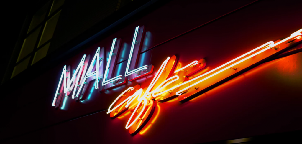
These are the signs which use neon gas to light up. They are made of vacuum tubes that manufacturers can mold into an endless number of shapes of different sizes. You can use it to create letters, graphics, or frames. Its main benefit is that it often lasts longer than other options.
Optimal distance
The optimal distance is the ideal distance from which a sign should be viewed. This is the best position from which to read and see its different elements. You should try to calculate this based on the distance where most of your audience will be. Besides this, you need to consider the viewing angle as well.
Outdoor sign
While some signs only need to be used indoors, others need to be used outside. Sign makers need to make them more weather resistant and durable. Examples of these are building signs, yard signs, and monument signs.
Positive space
Naturally, the opposite of negative space is a positive space. These are all the areas of the sign that are filled with content, whether it is text or graphics. This will include the main focal point of the board.
Pixels per inch (PPI)
Yet another abbreviation for you to learn. Pixels per inch is a term used to describe the pixel density of the image. The higher the density, the greater the resolution a picture has. Because of this, the image will be sharper, and you will be less likely to see individual pixels.
Proof
Whenever you plan on hiring a sign-making company, you need to ask them exactly how the final product will look. To do this, they will probably show you a small digital representation of the design. This is called a proof.
Push-through
The term describes graphics or lettering which is cut through the sign face and backing material, The manufacturers will then push it through and mount it on the inside of the sign face, so that extends out of it.
You can use this technique to create a 3D-effect. Many times, designers will put lights behind them to illuminate it from behind.
Real estate signs
Overall, this is one of the most popular signage products. They are often temporary and cheap and are coroplast or aluminum. Sign makers can construct them to be planted in the ground or fastened to poles or so on.
Recall
It’s great if you can create a sign that will catch your audience’s eye. But this isn’t enough. It needs to be memorable too. Recall can be defined as the ability of a viewer to remember the message even when they are not viewing it.
RGB
RGB is another popular color profile. But it is typically used only for digital graphics. In this case, the abbreviation refers to red, green, and blue. By combining these, you can also produce the full-color spectrum.
Sign area
You always need to make sure that your signage is up to code. Part of these regulations covers the size of the board. To check this, you need to calculate its total sign area. The formula for this is “width x height”.
Sign face
This is the area on which the copy and content will be printed. It is the front of the sign.
Target audience

This describes the profile of the most desired consumers for a particular product or service. These are the people that you want to see your sign. It’s crucial that you define your target audience. To do this, you need to consider aspects like their age, gender, occupation, and location.
Traffic count
There are hundreds of factors which affect where you place a sign. One of these is the traffic count. The term is used to refer to the estimate of how many people will be able to see a sign in a given period.
Typography
You can use this term to describe the overall style of printed words. This is influenced by its font, size, color, spacing, and length. It’s all about making your copy legible as well as attractive.
Visibility
SImilar to readability, this refers to the qualities that allow the audience to see the sign. You need to make sure that they can distinguish the individual elements and the whole from the background.
Wayfinding
These are features on a sign that enables people to find their way to a specific location. You can convey the directions in the form of arrows and pointers or text. Wayfinding signs should be helpful and informational.
Power of knowledge
This covers the sign terminology you need to know for the design and production of your signs. Knowing these terms will help you communicate with designers and sign making companies to make sure you get the product your business needs.
Now it’s all about putting these terms into practice. To do this, you also need to know more about the different types of signs. It may also be useful to check out our guide on what to look for from a sign making company.


