The function of signs is quite simple—say something so others can see it. Nevertheless, beyond that basic idea, there are so many ways to get the job done. This is why building signs are just one way to tackle message sharing. Still, there is an array of options available even when you’re on the hunt for building signs.
Building signs are actually everywhere, but you may never have thought of them by that name. In fact, businesses of every type on every street corner use them. So, let’s take a closer look at these signs. But be prepared—once you start looking at building signs, you’ll never see your own city the same way.
Dimensions of building signs
It would be great if we could start dishing out numbers and telling you exactly what length, width, and depth your building sign needs to be. Actually, though, it depends to some degree on what your own situation is. And also on what appearance you’re trying to create.
That said, you should begin your dimension planning by checking for applicable rules. For instance, if you have a business in a suburban shopping center, check what codes or rules apply to you.
So let’s outline some general principles to use as a starting point to consider your sign dimensions. Then, if you’re still not sure about sign size, check with your own sign specialist. After all, if they’ve created signs upon signs upon signs, they may have a thing or two to add.
Select a sign to fit the space
Obviously, you want to do a good job with the space you have. If you have limited space, don’t overload. Instead, go for a sign that’s proportional to the amount of space you’re working with. And steer clear of a sign that would look unbalanced. (Unless, of course, having an oversized name & logo is a calculated part of your branding).
Different types of signs have different depths, too. For instance, illuminated sign cabinets or channel letters will probably be deeper than rigid aluminum sign panels or banners. Yet, that doesn’t mean one is better than the other. Think about it in terms of your own space—will something flush with the building’s surface look better than something 3D?
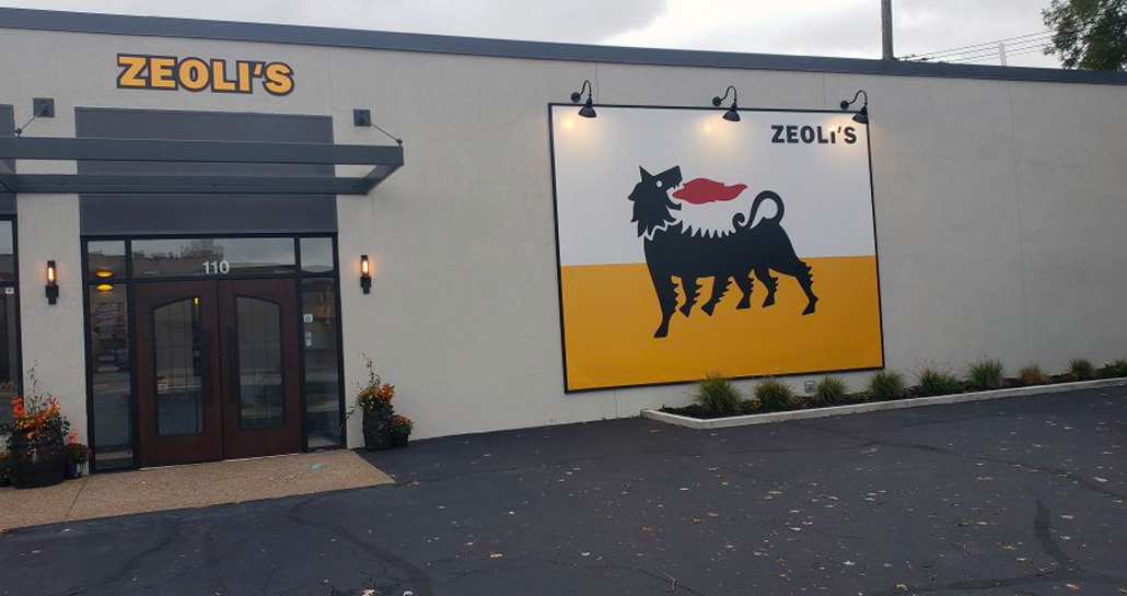
Also, consider “keeping up with the Joneses.” Or in your case, with other businesses nearby. Let’s say you look around and notice that every business in your strip mall has channel letters of similar size. Well then, you may want to think about doing that too. Whether it’s a requirement or not, the uniformity may help establish a cohesive look in the area.
Solid sizing decisions
In the above strip mall example, you have some sizing ideas to go on. What several others are doing may be a sound choice for you, too. However, you might not always have a benchmark like that to go by.
When selecting a size for your sign, think about this. One of the most important things is for your sign to be seen—by the people who need to see it when they need to see it.
Who needs to see it & when
For a moment, think about the who. Does your sign need to be visible to pedestrians? Or are you trying to reach drivers on a nearby road? Alternatively, is your sign supposed to be reaching out to motorists passing by at 65 mph on a nearby expressway? Obviously, a sign needs to be large enough to effectively reach its target audience from the spot where they’ll be viewing it.
Considering when your target should see your sign might prompt you to think about illumination. If your target is supposed to be able to see your sign at night, then you’ll want it illuminated somehow. Similarly, if you know your target’s going to be passing by your building when driving, be sure you take that into account. For instance, ensure that your sign can be read from the driver’s vantage point at their likely rate of speed.
Now, to tackle the when question from a slightly different perspective, keep in mind that not all building signs are designed for the same timeframe. In fact, while your company name and logo will probably be there for a while, some building signs may be temporary. For instance, you could use a building banner to promote a weeklong sale. Or you could design window graphics for a month-long campaign you’re running.
Note: Some of you may want a more technical perspective on sign dimensions. If so, take a look at the International Sign Association’s Design and Placement of Signs.
Design of building signs
Your sign is so much more than just the materials it’s made of and where it’s placed. Actually, the design is a vital part of the whole picture here. You could have a sign that’s impeccably made but looks terrible. And, frankly, at that point, is anyone really going to care that it’s been faultlessly constructed? If it looks terrible, it looks terrible.
Obviously, you want a sign that speaks well of your business. And you also want a sign that sends the right message. Different types of signs could be better at sending certain messages than others. So take some time to isolate your message—what is the message you actually want your sign to send?
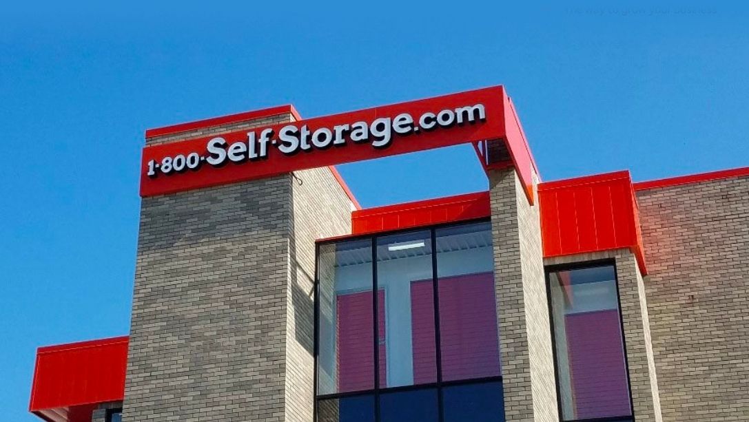
To illustrate why companies might choose different building signs, let’s imagine five situations. Five different companies, five different signs. And we’ll explore how the design of their signs varies.
The Jolly Juice Bar
Here’s a brand-spanking new business located in a busy suburban area. Fresh vegetable and fruit juices are the main attraction. But since they get a lot of lunchtime visits from business professionals working nearby, they also offer sandwiches and salads.
When the Jolly Juice Bar takes stock of their sign options, they know they want something peppy & fresh. Since they sell happy, healthy, great-tasting food, they want their sign to look as happy and healthy as a sign can.
Based on their needs and wants, the Jolly Juice Bar plans for their sign to be made of halo-lit channel letters. Plus, their logo will be right below. And they’re electing to put the channel letters and logo on a raceway instead of straight on the building. They’re choosing bright colors, and they’re thrilled that the halo-lit letters will look cheery and exciting even at night.
Paragon Wealth Advisors
Not too far away from the Jolly Juice Bar is a company owned by 5 financial advisors. The business has been around for 20 years, and it has a loyal client base. Recently, the owners have decided they need to expand their attempt to recruit new clients. Consequently, they’re rethinking their signage.
They operate from an office on the 1st floor of a large multi-tenant office building. Currently, their signage is limited to the wayfinding monument sign outside their building. It notes that clients can find Paragon Wealth Advisors at Suite 101. (And, of course, their glass door says “Suite 101”).
However, they are on the ground floor of the building. And they recently discovered that they would actually be allowed to install a building sign of their own outside their door. Here’s what they’re thinking of: a rigid aluminum sign panel. They’ll want it cut in a custom shape, and they’re thinking they’ll opt for a black field with gold lettering and outlining. Clearly, they need to keep their look professional and trustworthy.
Crunch Time
Now, let’s enter the case of Crunch Time. It’s a bare-bones type of gym, just waiting to be discovered by workout enthusiasts who don’t need all the bells and whistles. Since Crunch Time is committed to keeping things low-key by design, they want their sign to be low-key also.
Thus, they’ve opted to use a banner printed with their name and logo. Likely, it will take its place above the main entrance door of their brick building. As for the print on the sign, is it any surprise it will be simple and minimal? Just the words “Crunch Time” alongside the company logo (which is a stack of barbells).
However, this banner building sign is a short-term measure to some degree. Once the company has signed up enough members, it plans to paint the logo straight on the building front.
Data Moon
Data moon is a frantically busy tech startup. They have data management and data analysis solutions for just about everyone. And it seems just about everyone is asking for them. How such a small company handles so much work is anyone’s guess.
Since most of their clients find them via the internet, they’re really not worried about winning deals because of their signage. Still, the whole team agrees that they’d rather come into work and be greeted by a professional sign. (Currently, the outside of the building features blank walls.)
Data moon’s logo is a waxing gibbous with its name curved to fill in the lower left section of the circle. Since the name and logo combination makes a full circle, they’ve decided their sign will be round. And they want a custom cut metal plate. Underneath there will be a second plate that’s black (reminiscent of the night sky). And standoffs will mount the front plate to the rear plate.
Spark Electrical
Spark Electrical is a supply store for area electricians. Since the advent of online shopping, they have a lot of competition from online stores that sell electrical supplies. However, they do have one advantage—if you buy from them, you don’t have to wait for your product to ship. Thus, they want to attract busy electrical contractors who need their supplies today.
That’s why their priority when it comes to building signs is being seen. They want to be very visible both to contractors looking for them and for those who happen to be driving by. Thus, they decided on an illuminated sign cabinet that’s large enough to see easily from the road. And because they want it to be taken in at a glance, it will be simple. It’ll just have their name and logo (which is a lightning bolt).
Combination signs & more
Of course, some companies will elect to combine different types of signage. As an example, a gas station might have 3D letters on one side of their canopy. But on the other side, they might choose to have the same name/logo painted on the canopy itself.
Even among the options we’ve listed, there’s still plenty of room for personalization. Say you’ve chosen an illuminated sign cabinet for your company. Of course, you’ll be able to choose what the front panel will look like. But you may also be able to choose whether it will be squared-off or rounded at the edges.
Similarly, even a basic rigid aluminum sign panel will have design options to offer. For instance, you may be able to choose among different colors, fonts, finishes, and even shapes.
Installation of building signs
There are some signs that you don’t want to try to install on your own. Generally, if it requires a bucket truck, ladders, and scaffolding, you might think about steering clear. Still, don’t worry about it, there are companies who specialize in this kind of work. Chances are, just like manufacturing a sign is something you need an expert for, so is installation.
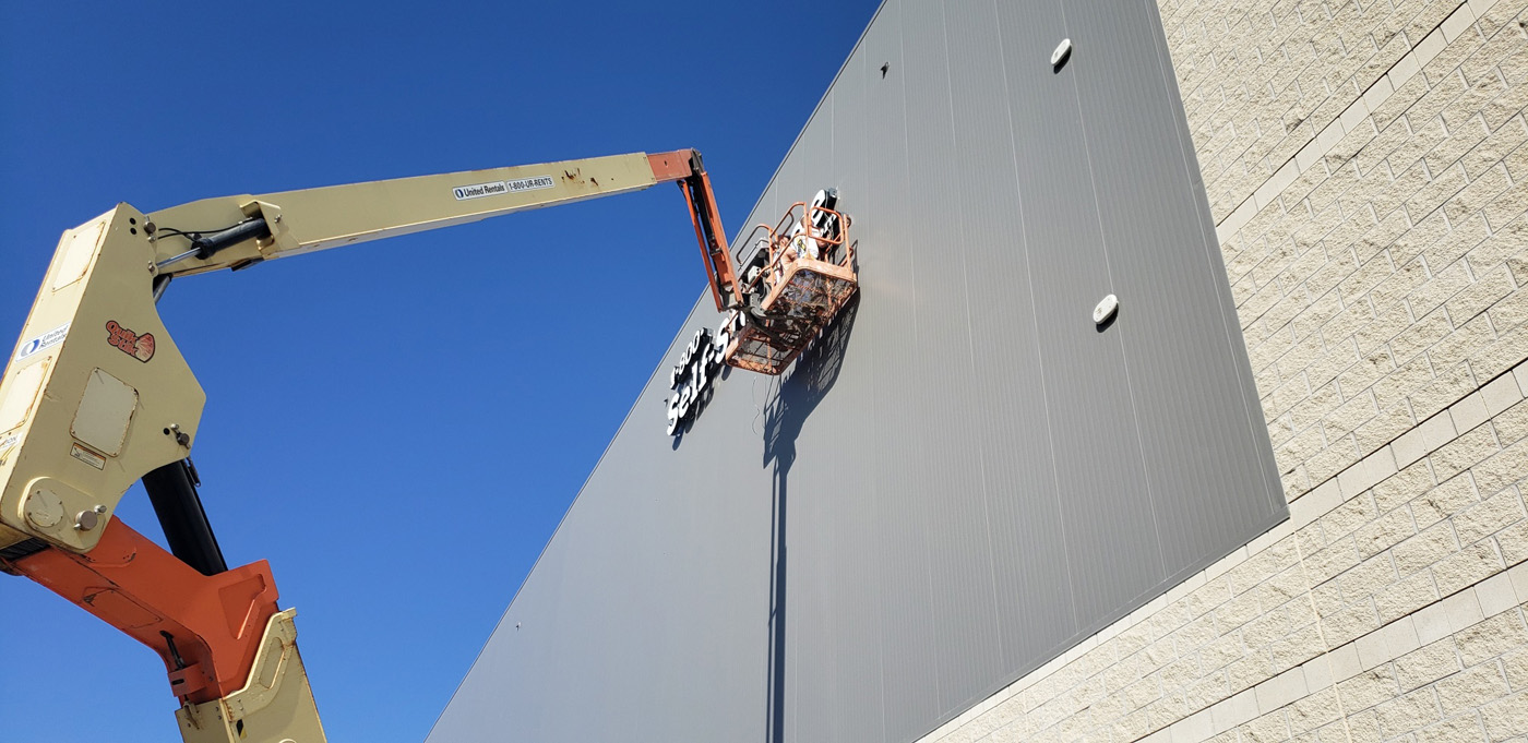
One thing you can do is find a company that does both the manufacturing and installation of your signs (and maybe even the design, too). This makes it a one-stop shopping experience for you. And your company will be with you and your sign from the ground up so to speak. It could even make them more invested in the project.
Installed by an expert
When it comes to the installation of building signs, hiring an expert means you should be getting someone who knows how it’s done. Plus, if they’re the ones who manufactured your sign, then they may know more about that particular sign and how to install it.
However, there may be times when you can install your sign on your own. For instance, in the case of a large banner on an exterior wall, you may be able to tackle the job yourself. It could call for screws & grommets, or you may want to use hooks.
And here’s another thing to keep in mind with installation—find a company that’s licensed and insured. For one thing, heavy machinery and heights carry inherent dangers. Thus, you want a company that will handle them responsibly. Additionally, you want a company that will take responsibility if things go wrong on their watch. And, obviously, you want to find a company that has any required licenses to operate.
Keep in mind
Before installing signs, you’re responsible to be sure you’re following local guidelines—applicable codes or rules for the area you’re in. Your sign specialist may be able to help here. And we recommend selecting a company that’s knowledgeable about local rules and regulations. That way, it could ease up some of your job.

Not just any sign
Once you’ve decided to use building signs to reach your customers and clients, there’s still plenty to do. Of course, you’ll need to design a sign that presents your business in the right light. So check out The Importance Of Good Signage & The Psychology Behind How It Works to get you thinking. Also, take a look at Tips And Tricks To Creating The Most Effective Signs For Marketing.


