Business owners often make the mistake that any sign is better than no sign. But in today’s world advertisements are everywhere. It is easy for ads to get lost in the clutter.
Never fear! Experience has shown advertisers what can make your advertisement a hit or a miss.
If you apply these principles by carefully and plan out your signs, you are one step closer to success.
Designing the right graphics can be tricky. That is why we are giving you a breakdown of tips and tricks to creating effective signs for marketing.
#1 Keep it simple
The old cliche is still true that less is usually more. Simplicity is at the heart of designing successful and effective advertisements.
Well designed minimalist signs are often better at
- Grabbing attention
- Keeping attention
- Making an impact
- Being memorable
Often, attempts to make adverts exciting results in making them overly complicated. You don’t want people to be distracted by unnecessary details. Otherwise, they could miss the point of the sign.
Instead, you want your audience to be able to notice what the ad is about immediately.
The following are steps you can take to make your sign simple:
1- Bare necessities: Ask yourself if each element is absolutely necessary? Can your sign work without it? Throughout the conception and design, you should analyze whether each part is essential to the ad. This should be a continuous process to weed out any unnecessary clutter.
2- Quality over quantity: Instead of spending time on hundreds of elements, focus on a few and do them well. A few brilliant features will have much more impact than a mishmash of poorly defined ones. Try to make every small detail the best that it can be.
3- Be clever: Simple ads often stand out because they are smart. The designers find a way to do as much as possible with as little as possible. This is the time to get creative.
Keeping it simple can be a challenge. But it can have massive payoffs.
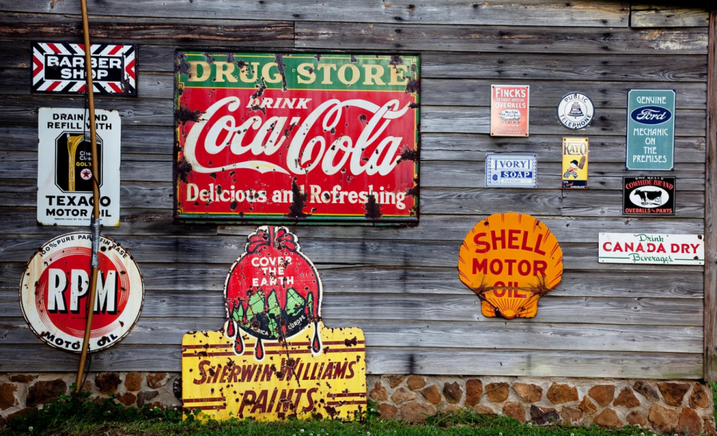
Unfortunately, businesses are often skeptical of whether a minimalist approach to advertising can work. If you still need to be convinced, take a look at these examples of super yet straightforward signs. They are striking and impactful.
#2 Color coding
Never underestimate the importance of color when you are designing an advert. Research has shown that this can have a significant impact on our moods and our responses to advertisements. As a matter of fact, entire theories have been designed for using color in advertising.
This is why you should select a color palette that matches the message of the sign. For example, green is associated with health and nature. So this is often a go-to color for healthy foods or products.
Don’t make the mistake of using colors that are too similar. Writing can quickly become lost against the background of the ad. So you need to use color carefully to create a contrast.
If your branding uses specific colors, you should try to focus on them. Or at least include them somewhere on the sign where they will be visible.
Very legible combinations are black on white, white on blue and black on yellow.
#3 Easy to read
We have all seen those signs which are virtually impossible to read. No matter how hard you try, you just can’t make out the words. This isn’t only frustrating to the audience. It can turn into a marketing disaster.

If the audience can’t read, they don’t know what the ad is about. Therefore, the sign failed in its purpose.
Illegibility is one mistake that you really want to avoid. If people need to strain to read it, they are probably going to skip it. Their eyes will instead wander to something else.
Luckily, it isn’t too tricky to get right.
Different factors influence whether you can read a sign or not. The following are the primary ones:
- Font: It’s essential to use a well thought out professional font on your sign. You don’t want to use one with too much ornamentation. The focus should be on finding a font that is simple and legible.
- Size: The typeface needs to be large enough to read. You shouldn’t need to squint. The words might look great up close but be impossible to make out once it is up.
- Spacing: You should pay attention to spacing. The closer letters are too each other, the harder they are to read.
- Amount of words: It is not only about the font and size but also about the number of words. Ads are much more difficult to read if there are too many words. People don’t want to spend too much time reading. So try to keep it as concise as possible.
- Words: You want a wide variety of people to be able to skim your sign. It works best to keep the words short and uncomplicated.
- Contrast: The color of the writing should stand out against its background.
#4 Think big
Another vital feature of creating an effective sign is to look at its size. You need to consider its dimensions carefully.
People often forget that the sign needs to be visible from a distance. Details of advertisements often get lost if you see them from far away.
To find the appropriate size for your sign, you need to have an idea of where you want to place it. Yes, you can just scale up dimensions for different spots. But this won’t necessarily always work. It usually works best to tailor-make the ad.
Imagine a sign on a building. It has to be seen from the ground, from the building across the road and sometimes from even farther away. The dimensions of these boards are usually set out to serve this particular purpose.
As we’ve said, choosing a font size is a crucial aspect of design. But this isn’t the only factor to look at. Any graphics or images also need to be visible.
Remember that size is even more critical in locations where the audience doesn’t have much time to look. For example, signs on the highway should be much, and the audience needs to understand its message much quicker.
The general rule of thumb is that the bigger it is, the higher the chance is that it will be noticed.
#5 Brand it
Consistency is crucial throughout a business, but especially when it comes to marketing. That doesn’t mean it needs to be boring. However, customers need to be able to recognize that the advert is yours.
This is where branding comes in. Effective signs, like other forms of advertising, are an extension of your brand. Therefore, it needs to reflect this in some way.
The key is that the audience should be able to recognize your brand immediately. Promotions often only hold people’s attention for a little while. So you want them to grasp what business the sign is about. This will also help to draw the attention of people who are familiar with your company.
Secondly, If they can recognize the brand people are more likely to act on the sign. Whether it is promoting a product, service, or event.
Keep in mind that you don’t have to include every aspect of your brand. The following are examples of features that you can use from your brand:
- Color palette
- The font you use.
- If your logo is well known, you can include it. But otherwise, it might take up too much space.
- Your motto or tagline
- Photos of your product or service
Branding is a central part of your business identity. It is essential that you create a coherent brand that portrays your message. Here is more information on the basics of branding your business.
#6 Sending a message
One trick to designing excellent signs is to formulate a clear message. This is basically the goal of the advertisement.
Do you want to create exposure for your brand? Is the aim to create awareness about a specific issue? Or do you want to sell a product?
It is easy to include too much information on the sign. But this can work to your detriment. You don’t want to confuse your target audience and leave people unsure about what the ad is actually promoting. That is why you want to keep the message concise and specific.
You shouldn’t try to include everything on one board. Instead, pick one specific product or service to advertise. Choose one that will be striking – like something new, something that is unique to your company, or one of your most popular items.
The sign isn’t there to give customers all the information about your business or product. Its goal is to attract their attention and to spark interest.
All of the design features should be focused on conveying the message. Everything from the color, to the font, are part of highlighting its purpose.
#7 Light it up
To light, or not to light?
The answer to this question depends on your specific advertisement and its location. It won’t work everywhere and can be a bit expensive. But if you use it well, it can make a huge difference.
Lighting can help to catch people’s attention. It is particularly useful if you want people to see the sign in the dark or even be able to read it at night. Billboards next to highways are usually lit up for his purpose.
Experts know how to use lights to highlight specific features on board. You don’t necessarily have to light up the whole thing but can shine it on particular parts.
Another option is to use lightboxes or LED signs. With these, the whole sign will be made from light. This usually works best to indicate a place.
In general, lighted signs are only used outdoors or in windows.
#8 Location, location, location
You need to remember that design isn’t the only part of making your signs effective. Advertisers need to carefully consider where the final product is going to be displayed.
You might not know the precise spot beforehand. But you should try to get a general idea. Experts know that the location is going to impact how a sign should be designed. Making sure that it is going to be suitable is vital.
If it’s placed in an unsuitable location, the success of the sign diminishes. And in the worst case scenario, you might be restricted from putting up the sign at all.
Many areas have local rules about what signs are allowed and what not. This can involve the size, shape, and content.
Besides these regulations, you want to make sure that the advert is going to stand out. Try to design it to look unique in its location.
You might not be able to place one sign in a variety of places. Designing several versions of the same ad can be helpful. They can resemble each other but can be customized to suit different locations.
Ask yourself who should see the sign? In what area is your target audience? Where will you get the most exposure? Will it stand out in the environment? Is it going to clash with its surroundings?
Here is a list of possible locations for a sign:
- Next to roads or highways
- Over or above roadways and highways
- In a yard
- On vehicles
- Bus stops
- Train stations
- Business windows
- On a building

In the end, you should try to choose a place with excellent visibility that gets a lot of traffic.
Close the deal with effective signs
Signs are an important puzzle piece in any marketing campaign. These tips and tricks lay out fundamental principles in the advertising industry. They can help you to design effective signs that will put your product in the spotlight.
Once you have chosen your design, you should hire a company to help you print them. Take a look at the types of signs that we offer at Signarama.