About The Client
Stewart Realty came to us through a referral. They are part of the Rochester Hills Chamber and we have had the pleasure of golfing with them. Located in the heart of downtown Rochester, Stewart Realty was looking to get a sign that would help draw in clients.
Project Overview
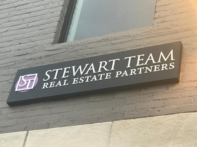
Stewart Realty already had their logo and color scheme for the sign. We worked with them to design a sign that would best incorporate their brand book. Originally we proposed illuminated channel letters on a backer but we soon learned that they shared the building frontage with another company, which caused the size of the sign to be reduced drastically. Having channel letters did not make sense anymore; instead, we offered a pan sign.
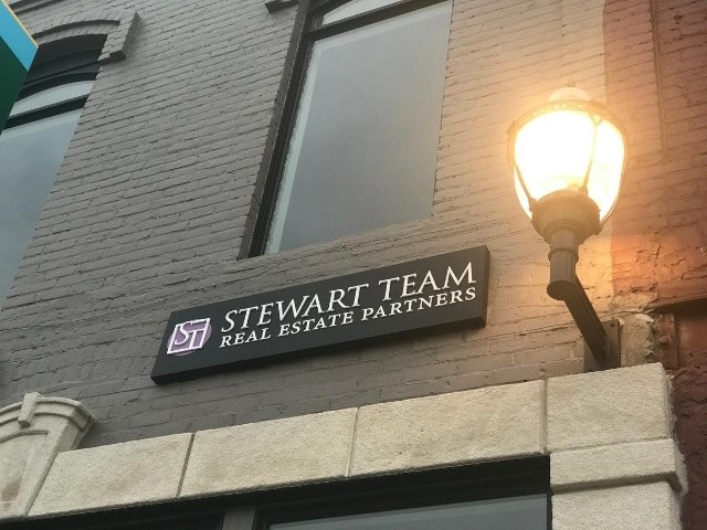
To get creative, we suggested acrylic letters to add dimension. We also decided to go non-illuminated to keep the design simple. Stewart Realty’s brand colors include purple, black and white, so the design came out to have the acrylic dimensional letters in white, mounted to a black backer. The logo displayed a purple background color with the ‘ST’ letters white. The sign was installed onto a gray building, which complimented the color scheme of Stewart Realty.
The Result
The team at Stewart Realty loved their sign. Overall, this project took about 4 weeks to complete. The pan sign ended up being the best choice as it sits centered in the lease space of the company and adds a charming look to the beautiful downtown Rochester. Since then, Stewart Realty has continued to order their realty signs with us.


