About The Client
FoamPartner has been a long time client of ours, so when they needed to rebrand their company, they came to us! As you can probably guess, FoamPartner is in the world of foam. Their supply ranges from mattresses to car seats, and from foam barriers in recording studios to packaging foam. When we first started working with them, they were called Ottorbock. We produced all of their interior signage and then expanded to the outside. Eventually they purchased a second building and then they went through a rebrand to FoamPartner. They liked the work we did for them before and trusted us to create their new signage, including redoing all of the interior signage we had done before as well as the new exterior signage for the second building.
Project Overview
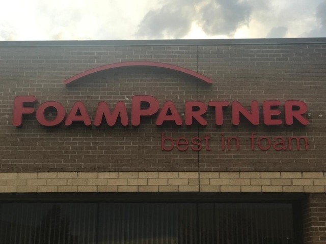
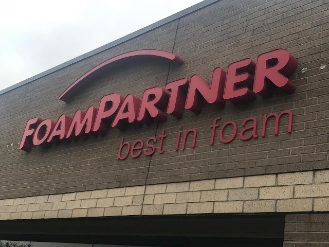
With the new rebrand, FoamPartner already had the logo and color scheme brand book. Red was their main brand color and this gave us a few options to work with. If FoamPartner wanted white channel letters, they could mount them to a red backer and attach it to the facade of the new building. However, they chose to go with individual letters without a backer, which allowed them to go with full-on red letters.
The illuminated channel letters are 5″ deep with red trim caps. We did translucent red vinyl over the letter faces and did red LED lights on the inside to be sure the color stayed red at night. The ‘Best in Foam’ tag line is made of acrylic dimensional letters. Both sets of signage were stud mounted to the front of the building,
The Result
From start to finish, the project took between 4-6 weeks. This included the site survey, the design, the fabrication, and the installation! FoamPartner was thrilled with their new set of channel letters. The red really pops against the brick facade and it’s even better at night, lighting your way to the ultimate foam vendor!


