Do you want reverse channel letters for your business? But feel lost about where to start?
We’ve got your back. You can handle this article as your complete guide to reverse channel letters. It will cover what these signs are and how they are made. But also how you can design them to be useful.
What are reverse channel letters?
Let’s jump right into the deep end and cover what reverse channel letters are.
The world of signs is vast. There are so many different products and options available for business owners. It is easy to get lost with all this information.
In brief, channel letters are metal letters that you would typically use as building signs. They are lit up by LED light bulbs. The standard signs are front-lit, which means that they are illuminated from the sign face.
On the other hand, reverse channel letters are often backlit. This means the light shines from the back face. They are mounted slightly away from the building so that the light is typically projected onto the wall. It creates a unique “halo” like effect.
No matter what type of channel letter you choose, they are the perfect way to make your building stand out. It will light up your storefront even at night.
That is why they are a brilliant solution to put up your company’s name.
The lowdown on their fabrication
It might sound unnecessary, but if you want to commission reverse channel letters, it can be useful to know the basics of their construction.
First off, they are three-dimensional signs. The body of the letters is made from aluminum and acrylic.
The front face and sides of the structure are mostly metal to prevent light from passing through. The back is polycarbonate or acrylic to make your sign shine.
This means that the face and body of the letter usually appear dark but is outlined with light.
Pros of reverse channel letters
So why do you need to choose these signs for your business?
There are many different exterior signs that you can use on your building. But the unique features of reverse channel letters make them particularly suited for getting viewers’ attention.
Take a look at the benefits that make these signs really standout:
- Thanks to the materials, these letters are lightweight. This makes mounting and handling just so much easier.
- The signs are durable. They are long-lasting and weather resistant.
- They’re suitable for use outside.
- The halo effect creates a warm atmosphere for your storefront.
- LED diodes are energy efficient and can be a fantastic green solution.
- There is a range of customization options.
- The lighting provides exceptional visibility no matter the time of day.
- They are lightweight.
You can use channel letters for any type of business. However, it will probably be the most useful for ventures like restaurants that stay open at night too. In this case, you want to draw the nightlife in.
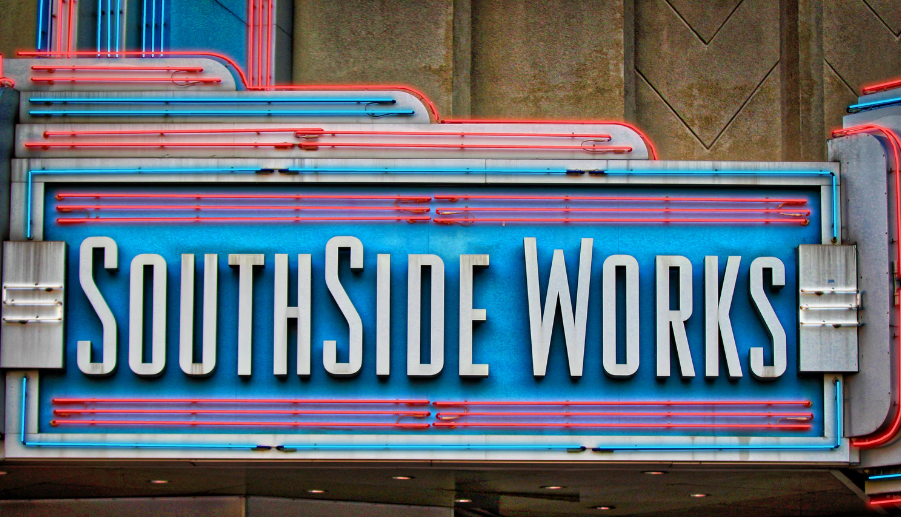
Goal-driven
What is effective and what is not might seem obvious. But whenever it comes to signs and their design that isn’t necessarily the case. You have to decide what the right outcome is for your company.
To do this, you need to assess two critical things. Your target audience and your goals.
The target audience is the specific group of people you want to reach with your marketing message. In terms of goals, it’s up to you to figure out what you want to achieve with your channel letters.
It is all about making your signs work for you. You want to see results from the products.
Experts know that each of their designs needs to be created with specific objectives in mind.
So a pro tip is to make this a vital part of your design process.
Design process
The way to get results is through intelligent design. You need to pay careful attention to each element of sign. We will look at the most important of these features down below. But first, we will give you a guide to the actual creative process.
Follow these simple steps to design a successful reverse channel letter.
1. Set up your objectives
Risking repetition, we have to look at how exactly you can decide on your aims. Ask yourself what your business is missing.
Do you want to inform new customers about your business? Or are you just trying to make your storefront more visible to existing customers? Does it have to be visible during the day or at night?
On top of this, you’ll have to figure out what you want to convey with the sign. A toy store wants to look fun and perhaps even whacky. The owner can choose to use pops of color and funky fonts. But this will look seriously out of place and also inappropriate for something like a pharmacy.
If you’ve hit a wall, call in your team and ask them for advice on what you want to accomplish. People in different positions will have different perspectives on what your business needs.
Make a list of priorities, every single thing you can think about. Then rank them from most important to less important. This is a fantastic way to narrow down the list and find a few aspects that you should focus on.
2. Define your audience
We can’t stress enough that you need to develop a complex picture of your target audience. This step goes hand in hand with setting up your objectives.
Together with deciding what you want to achieve with the sign, you should determine who you want to reach with it.
Is the target market new clients or existing clients?
Then figure out who these people are. There are two main ways you can do this. First, you can research the primary customers for your own company or companies with similar products and services. Secondly, paint a picture of the type of clients you would like to attract.
Create several possible audience profiles based on people’s demographics, their needs, their likes, and dislikes.
3. Brainstorm
With that grind out of the way, you can have a bit of fun. If you like being creative, that is.
Brainstorm about possible ideas for your sign. You will probably only have your business’ name on the sign. But sometimes you might want to add something a little extra like a founding date or so on.
Also, come up with ideas about all the possible elements for the letters.

You can do this by yourself or with members of your team. Or, if you are planning on hiring the services of a pro, you can collaborate with them.
4. Develop drafts
By this stage, you are probably sitting with more ideas than you know what to do with. But that can be a good thing. In this stage, you will narrow down those ideas.
You will also get to develop the best of the drafts.
Take a break between brainstorming and this step. This will mean that you can look at your ideas with a fresh perspective.
Now you can scrap the really bad or impractical ideas and refine the others.
If you can, focus on five or so designs. You will need them for the next step.
5. Hire a sign company
Next, it should be about time to hire a sign making company. It will be necessary to get their input.
To start off, you should look for several companies who can fabricate the sign.
Ask for a quote from each of them. It might be necessary to arrange a meeting to show the company’s representatives your design ideas. This will probably influence what they are going to charge for them.
You should try to ask all the critical questions about their signs like the fabrication time, the materials used, their durability, and longevity.
A pro tip is to take a look at their portfolio. Specifically, ask for examples of similar products that they’ve made.
All of this information should be able to help you decide on the right sign company for you.
6. Finalize your design
Finally, all that’s left to do is to finalize the sign.
It can take an expert eye to streamline the finer details. And to see whether a sign will work in practice or not. A designer’s advice can be beneficial during this step.
Remember that many sign companies, like us here at Signarama, offer a variety of creative services. They should be able to tell you what is impossible and what isn’t for their fabrication system.
Customization
You might think that there is just so much that you can do with letters. However, you’ll be surprised.
One of the best features of reverse channel letters is their customizability. Using this to its full effect is what will allow you to create the ideal signage solution.
Designs need to be original to be exceptional. You need to combine all the must-have elements into a unique whole.
Here are four of the most crucial aspects of the sign:
- Typography
- Lighting effects
- Branding
- Mounting
Typography
You probably guessed it, but the most crucial feature of channel letters is undoubtedly the typography. The sign is focused on words, after all.
So you need to pay attention to the font, spacing, and the size of the letters.
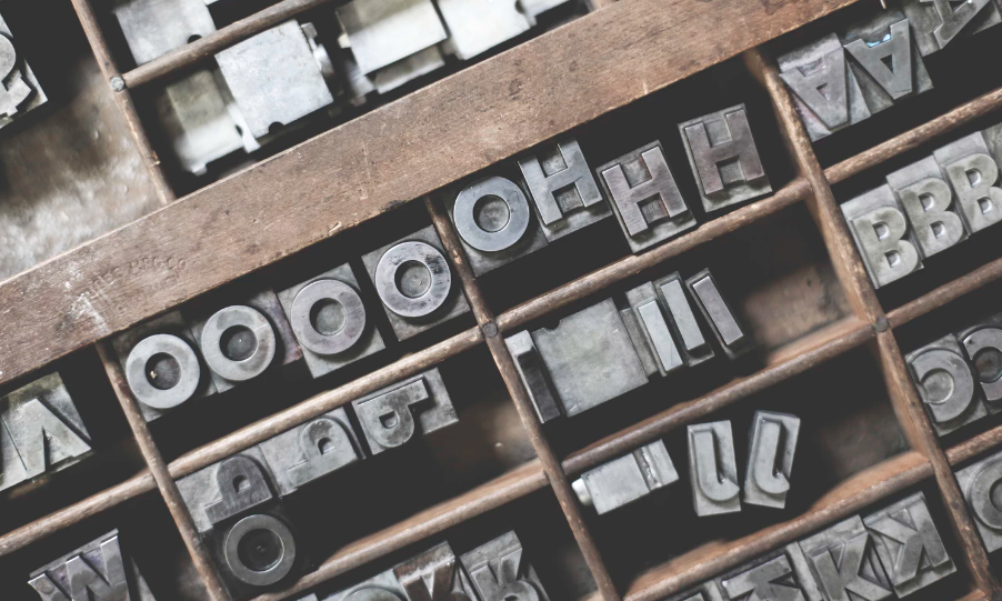
First, let’s look at the font. Flowing script is gorgeous and elegant. But will people be able to read it? Your sign should be readable during the day and night from a distance. This should be the most prominent consideration.
Also, keep in mind that different fonts convey different feels. This is key to creating an atmosphere.
Second, the more words or letters you use, the more crucial the spacing becomes. If you don’t do it right, the results can be unfortunate, to say the least.
Third, tiny letters aren’t going to cut it. VIsibility and readability are, once again, the fundamental guidelines.
Brand identity
Brand identity is only beneficial if you keep it consistent. That’s why your signage should reflect this too.
You can convey this by using your iconic typeface or color combinations.
This will help your customers to recognize your business from a mile away.
Choosing the mounting
Standard channel letters are usually installed flush to the wall unless you request otherwise. Sign makers call this direct mounting.
On the other hand, reverse channel letters aren’t attached straight onto the wall. You can’t create the “halo” effect if it doesn’t stand away from the building.
In this case, manufacturers usually use raceway mounting. This means that the letters are attached to a metal box in which you will house the electrical wiring and power supply.
Ask your sign company if they have more than one option for mounting. You will probably be able to choose whether the raceway blends in with the channel letters or with the building on which they are mounted.
It’s a good idea to check local building regulations about mounting to make sure your sign complies.
Write your name in lights
Shiny! Need we say more?
Perhaps just a little bit. Your sign company will be able to tell you how you can customize the lighting effects on the letters.
You should ask about the size of the halo that the light creates. Do you only want to create a thin outline around the letters? Or do you want to paint the wall in lights?
Next, you should consider the color of the lights. It doesn’t have to be the standard white or cream. You could choose colored acrylic for the back face of the letters or colored LED bulbs for a different effect.
Shining examples
Hopefully, this guide will help you to design efficient and successful reverse channel letters. It boils down to taking all the information available to you and use it.
A great way to learn about design is to look at examples. So if you are eager to learn more, check out exterior building signage examples: what to do & what not to do. This will help you prepare your own signs.
Our article on what to look for from a sign making company + questions to ask is also a fantastic resource to read before you hire a company.


