As a business owner, you know that you need signage to share your message with the world. Or at least with your customers and clients. Signage can take any number of forms and be placed in an exciting array of locations. But today let’s zero in on one specific type of signage your business can use—point-of-purchase (POP) signs.
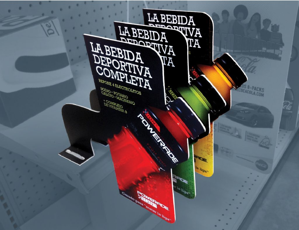
POP signs can be placed beside the products they’re advertising. For instance, if you’re a convenience store, you might place your energy drinks on a pre-constructed cardboard stand-up display. The display both advertises the drinks and offers a convenient surface for them to sit on.
Naturally, you can learn a lot from others who have done well with their point-of-purchase signage. Let’s examine some tips for POP signs first. Then, we’ll explore some unique examples to help you gather visual inspiration.
Use a big number
One way to make an impression with your point-of-sale signs is to splash a big number across the space. And when we say big, what we mean is that the visual image of your number should be large. Printed large, your number can function to get the attention of passersby. And if your deal is a financially sound one, your customers should be surprised and/attracted by what they see.
For instance, this method could work if you want to advertise a selection of candy bars and snacks that you sell at your customer service desk. Craft a sign that lets customers know that food is available. And if your snacks cost customers $2.00 apiece, try letting that dollar figure shine. A giant “$2” featured prominently on your sign could snag the attention of hungry (and thrifty) potential customers.
Make it easy to take in
Obviously, “easy to take in” is a bit of a relative term. And how easy information is to absorb depends on the location where one is absorbing it and the amount of time they have to do so. Thus, the principle here may actually be to simply fit your information to the space you’re in. And to make it match well with the amount of time you expect your prospect to have.
For instance, a point-of-purchase sign posted near the checkout aisle of a grocery store may need to be short and sweet. Especially if your store usually gets people through the checkout line quite quickly. However, a POP sign placed near an airline customer service desk may be able to dig more deeply into your subject matter. Especially if your airline customer service queue is usually quite long at any given time.
Feature an intrinsically interesting design

Maybe this point should go without saying. But as we always advise, your signage is only as good as the graphics you use. Strong visuals make for strong signage. And in the case of a POP sign, that still holds true.
As an example, if you’re selling a particular drink, consider featuring a cutout of your drink in your signage. Or find other creative ways to directly relate your signage to the product you’re offering.
Go big or go home
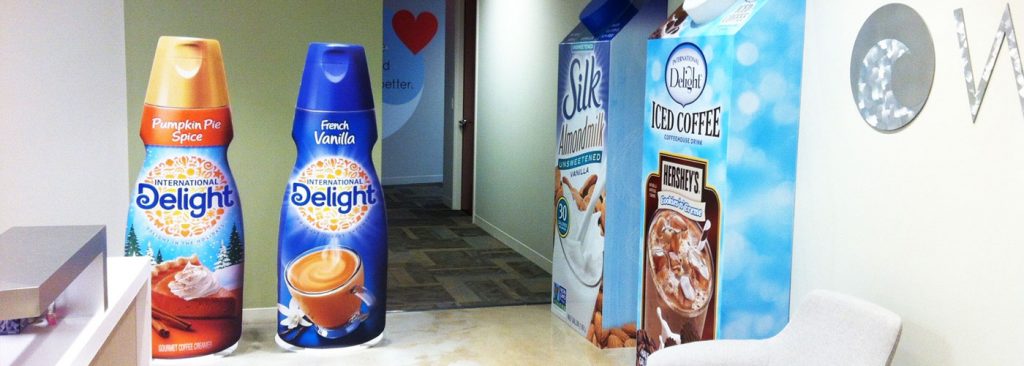
As you’ll see in the examples below, sometimes your product itself can form a showstopping point-of-purchase sign. Simply size it up. An oversized version of the product you’re peddling might be just the thing to catch customers’ eyes and get their attention.
Visuals to inspire your signage plans
Take a look at these options to get your wheels turning. Then head out and create your own eye-catching signage.
1 – Enormous coffee creamer signs
Check out these oversized coffee creamer and dairy alternative signs. Imagine the delight of adults and children alike when they encounter signs this large near your checkout or customer service desk.

2 – Chiquita – Minions go bananas signs
Sometimes appealing to cultural figures can help out your signage. Take a look at this Chiquita display (photo 1 of 10) where Despicable Me’s iconic minions take center stage—dressed in festive fruit headdresses.
3 – A POP display that really pops (and is made of pop)
You know what it feels like to open the pull tab on a carbonated beverage and take that first sip. It definitely leaves your mouth feeling energized—thanks to all of those bubbles. Here’s some unique signage that radiates energy and an upbeat mood. And it’s constructed out of the product itself. What better way to advertise your product than by creating a work of art with your product?
Plus, check out this pop display that’s slightly more subdued and respectful, but no less eye-catching.
All the signs you need
Once your point-of-purchase signage is well planned and executed, take a moment to think about what other signage your company could use. Check out A Glossary Of Sign Definitions & The Distinctive Features Of Each to learn more about your signage options. Or try The Small Business Owner’s Guide To Creating Your Own Unique Signage to learn how to create signage that uniquely reflects your company.


