The Americans with Disabilities Act (ADA) was a significant landmark in the fight for equal access for people with disabilities. It helps to improve the lives of millions of Americans every single day and has inspired other countries and international activists to follow suit. Business owners are responsible for making sure that their company and its assets are compliant with the relevant standards and regulations. Here is our guide to help you understand the accessible signage guidelines and implement them in your designs.
The lowdown on accessible signage guidelines
The history of the struggle for equality for individuals with disabilities is a fascinating one.
On 12 March 1990, disability rights activists descended on Washington. They demanded the passage of the Americans with Disabilities Act (ADA), which would give equal rights to people with disabilities.
The critical event of the day was called the Capitol Crawl, when 60 activists abandoned their wheelchairs and mobility devices. They then began crawling the 83 stone steps up to the U.S. Capitol Building.
Now, the protest is celebrated as a critical contribution that helped to push President George H.W. Bush to sign the Americans with Disabilities Act of 1990.
The ADA standards outline regulations about the construction of buildings and the designs for signs too.
These include measures like constructing accessible parking, entrances, paths of travel and restrooms, and signs that allow people with disabilities to access spaces independently and safely.
Why should I make my signs accessible?
We can only truly see the world through our own eyes. Unfortunately, this means that people without disabilities may overlook accessibility as they don’t need it themselves. They may also be unaware of the challenges facing individuals with disabilities.
It’s important to understand that there are severe consequences if you don’t make sure that you are compliant with accessible signage guidelines.
First, compliance is a legal requirement. The ADA is a federal law. However, you should be aware that your state or municipality might have additional regulations regarding accessibility. If you do not comply, you could be saddled with a hefty fine and be required to become compliant.
Second, by making your signs compliant, you are making them accessible to a much wider audience. You might be losing existing and potential new customers all the time and not even know it because they have difficulty using your services.
Lastly, if your signs are not accessible, you could be alienating some of your staff. This can have detrimental effects on their mental health and also on their job performance and productivity.
As a result, staying ADA compliant will both help your community and be beneficial for your business.
Which signs must be accessible?
ADA signs are necessary for all the areas of your business that the employees or your staff have access to.
In general, signs that need to be compliant should include but aren’t limited to the following:
- All directional signs such as ones pointing to your reception.
- Signage that you use to identify permanently dedicated rooms that will not change function, such as a restroom, lunchroom, storage room, conference room, restroom, or closet.
- All informational signs like “Employees Only.”
- Signs highlighting the location of building floors, stairwells, and all exit levels.
- Restroom signs.
- The different types of overhead signs like “Stairs.”
Design tips for accessible signs
Reading the entire American Disabilities Act can be quite challenging. So to help you out, here are some tips on complying with the main accessible signage guidelines.
You’ll notice that many of these standards are centered around assisting people with visual impairments to understand your signs.
These regulations apply for interior and exterior signage.
Color palette
One of the critical requirements for ADA signs is to choose a suitable color palette. Using some color combinations can make it far more difficult to distinguish and understand the content of the board.
One reason that this happens is that the colors are too similar. Another is that shades that clash too much can blur. Besides this, some visual impairments like color blindness impact how people distinguish between colors.
Examples of “bad” combinations are red/green, purple/blue, orange/yellow, or two hues of any one color.
Therefore, you need to use contrasting colors on ADA signs. Typically, these types of palettes are best for any kind of sign.
You can use a color wheel to help you decide on the perfect combination by choosing complementary shades. These are pairs that sit opposite each other on the circle.
Of course, a quick and easy way to create contrast is to use light and dark colors. This will help distinguish between the different elements of the design. For example, the background can be a dark blue while the text and symbol are white.
Say no to glare
Another feature that is notorious for making signs challenging to understand is glare. This refers to the difficulty of seeing in the presence of bright light. In the case of signage, it usually happens when sunlight or artificial lighting is reflected off its surface.

To make your signs accessible, you need to ask your sign company to coat the surface with a non-glare finish. Remember that it has to cover both the background and the characters or other content.
The board might look less glossy and shiny. But at least it will be visible.
Also, be mindful of the position of the sun or artificial lights relative to the sign.
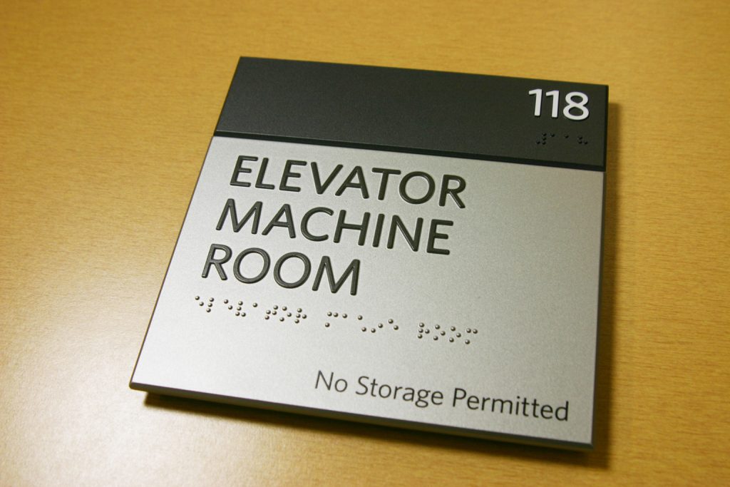
Working with text
For compliancy, your ADA signs must include braille as well as tactile (raised) letters.
The braille needs to be Grade 2, also known as shorthand braille. This system incorporates 189 contractions and short-form words. Because the braille is so condensed, it is ideal for the limited amount of space on signs.
The shapes of the dots need to rounded or domed. And they should be lower case except if the words are proper nouns, initials, acronyms, the first word of a sentence, or if the letters are part of a room number.
Besides this, you need to place the braille below the text with a 3/8 inch clearance on each side.
On the other hand, tactile lettering must be 1/32 inch raised capital letters.
Only the best fonts
Next, you have to choose the right typeface for your accessible signs. There is an ever-growing variety of beautiful and exciting fonts to choose from. However, there are a few specific guidelines that you need to follow to be compliant.
Thankfully, the regulations are relatively straightforward to apply:
- The font needs to be sans serif.
- All of the characters have to be uppercase.
- Don’t use styles that are oblique, italic, or too condensed. Neither should you use ones that are ornamental, script, or unusual.
- You should choose a typeface with characters where the width of the uppercase letter “O” is 55 percent minimum and 110 percent maximum of the height of the uppercase letter “I.”
- The text height has to be between ⅝ inch and 2 inches.
Overall, applying these standards will make the content of your designs more comfortable to read.
So, a few popular fonts that are ideal are:
- Futura
- Helvetica
- Franklin Gothic
- Optima
- Verdana
- Trebuchet
- Arial Bold
- Avenir Medium
- Eras
- Frutiger
- Lucida Demibold
Use specific spacing
You’re not done with the text yet. Aside from the above, you should check that you use approved spacing protocols.
You should measure the distance between the two closest points of adjacent tactile characters. In short, the spacing between them should be a minimum of ⅛ inches. The guideline excludes word spaces.
On top of this, characters should be at least ⅜ inch away from borders or other decorative elements.
Symbols all the way
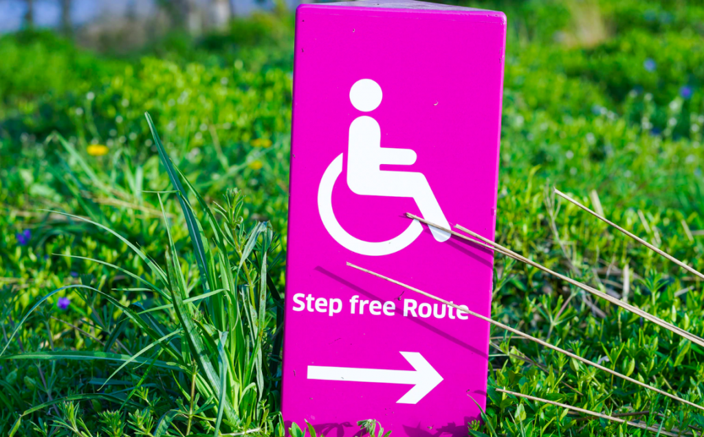
Symbols are fantastic tools in communication. You can use them to make any sign easier to understand.
Your ADA signs must contain the applicable ISA symbols and other relevant graphics. Which you need might depend on local requirements and those for your specific type of company.
However, everyone needs to use the following pictograms:
- Wheelchair
- Ear to symbolize the availability of an assistive listening device
- Phone symbol with sound waves for volume control phone
- A keyboard, representing a text telephone
Other recommended symbols are ones for:
- Different types of restrooms
- Stair accessibility
- Safety signs like ones for a fire extinguisher
You need to design the signs so that the pictograms sits alone on a 6-inch high background area. Provide text descriptions for signs with a symbol to label rooms or spaces. But signage with pictograms that provide additional information about a room don’t require text.
Place tactile text directly underneath the graphic and braille underneath that.
Be selective
We all want to make our signs exciting and pleasing to the eye. But that shouldn’t always be your top priority. In terms of ADA signs, it is all about accessibility and sticking to regulations.
That’s why you want to be incredibly picky about the context of your signage. In this case, you should only include the content that is necessary. Usually, this will only include the tactile text, braille text, and the relevant symbols.
Perhaps, you could also incorporate a border around the edges to improve the overall visibility. But in most cases, that’s all.
So, in the end, your design is going to be clear and clutter-free.
You can save all the extras for your other signage. If you want to incorporate more personality, use a combination of compliant signs and others, which allow you to get creative while still providing equal access.
Get the installation right
Don’t make the mistake of thinking that the design only refers to the content and appearance of the sign. The process applies to all the aspects of creating your signage. One of these is how they are mounted.
According to the ADA, there are specific requirements you need to use when installing accessible signage.
Usually, you need to place signs that identify rooms next to the relevant door. It should be mounted between 48 inches, measured from the bottom of the lowest raised character, and 60 inches, measured from the bottom of the highest, from the ground.
You can use these same height guidelines for most types of ADA signs unless the relevant regulations state otherwise.
The deal with parking signs
Generally, the standards apply in more or less the same way to all types of signs. However, it is a different case altogether for accessible parking signs. These are signs that you usually mount outdoors to indicate ADA parking spaces.
Each one has to include the International Symbol of Accessibility, which is the wheelchair symbol. And you need to mount it a minimum of 60 inches from the floor so that your visitors can see it.
If you have spots that are dedicated for vans, you should incorporate the text “Van Accessible” into the design.
Asking the pros
There is much to be learned about making signs the right way. Besides ADA compliance, you need to worry about other factors, like the effectiveness of the sign as well. No wonder designing signage can be a daunting task.
Luckily there are experts out there who know all the ins and outs of the industry. Consult with them about the designs for all the signs you want to print. They can help make sure they are up to standard.
Many professional companies have ready-made options for you, as well. If you are in a hurry and just need to get a few basics signs, you could choose one from their collection.
Essential signage
Following these tips is the first step to making sure you are compliant with accessible signage guidelines. But as we’ve said, one of the most crucial is contacting your local sign making company and asking their advice. They can help you make your designs a reality.
This isn’t the only essential information that you need to know when creating signage for your business. If you want to know more, take a look at the restaurant owner’s guide to meeting safety requirements for signs and designing signs for colorblind viewers.