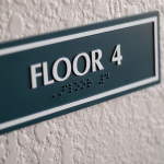
It’s the responsibility of business owners to check that their infrastructure is as accessible as possible. This includes your signage, as well. Unfortunately, people often overlook colorblindness when designing their signs.
By adapting your signage, you can make the products friendlier and eligible for a broader audience. In this article, we are going to answer all your questions and give you our tips for designing signs for colorblind viewers.
What is CVD?
Color Vision Deficiency (CVD) is the scientific term for colorblindness. Although we use the latter term more commonly, the former is a better description of the condition and how it works.
Trichromacy means that all three types of cones in your eyes are working correctly. People who see in this way are considered to have normal vision. In anomalous trichromacy, all the types can perceive light, but one is faulty, so it won’t perceive it as usual.
In short, CVD is the inability to distinguish between some colors and shades. Therefore, having the condition doesn’t mean that you can’t see any at all. Total color blindness is very rare. Instead, most people can identify some colors but not others.
In the case where only two cones can perceive light, it is called dichromacy. Overall, there are about 10,000 possible combinations.
Common types of CVD:
- Red-green color blindness: It’s the most prevalent condition. Reduced sensitivity to red lights is known as protanopia or protanomaly. And reduced sensitivity to green light is known as deuteranopia or deuteranomaly. In this case, it is difficult to distinguish between reds, greens, and oranges and cause blues and yellows to stand out.
- Blue-yellow color blindness: The condition is called tritanopia or tritanomaly and is incredibly rare. It alters the ability to distinguish some blues from greens and some yellows from violet.
- Total color blindness: Overall, this is the rarest type occurring in 1 out of 33,000 people. Experts refer to it as monochromacy or achromatopsia. People with this condition will see no color, only black and white.
Of course, there are many variations that fall under these types.
Typically, CVD is a hereditary (genetic) condition. So, people are born with it, and it’s passed down from their parents. However, acquired color vision defects can sometimes be caused by chronic illnesses, accidents, chemicals, or medications.
How can you test for colorblindness?
Unfortunately, color blindness can sometimes go undiagnosed for years and even decades. The first time people often pick up something is wrong is when children start school.
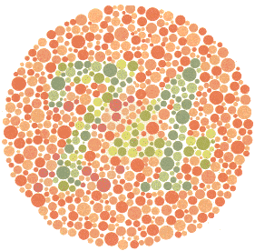
If someone is worried about their vision, they should go to see their local eye doctor. They can diagnose you by administering a basic test like the Ishihara Color Test. Or they can use more sophisticated and professional protocols and tests.
Benefits of designing accessible signage
Besides doing a good deed, what can you and your business gain from designing signs with colorblind viewers in mind?
- First, you can reach a much wider audience. More or less 8% of all men and 0.5% of all women have a form of CVD. The incidence rate is higher among Caucasians and Asians. It’s something to keep in mind when you are researching your target market.
- Secondly, your signs will be more legible for people with CVD. Otherwise, they might miss out on some of the details and information.
Don’t forget that this isn’t only about accommodating your existing and potential customers. By making your signage more friendly for people with CVD you might be helping some of your employees too. Following these tips will certainly make their lives easier.
Colorblind workers will find it much easier to do their work, and feeling included will be great for their mental health as well.
Tips for designing signs for CVD viewers
Now that you have all the basic information, you can start thinking about designing your signs for colorblind viewers. There are a variety of steps you can take or tricks you can try to make your signage more accommodating.
We are specifically looking at tips you can use for designing signs. However, you can use it for all your media like newsletters, flyers, business cards, and websites.
1 – Avoid certain color combinations
One of the easiest solutions you can try is to avoid some of the palettes that are often problematic. Doing this will be much more manageable if you are creating the designs from scratch.
In general, it’s safer to avoid the following combinations:
- Green and red
- Brown and green
- Blue and purple
- Green and blue
- Light green and yellow
- Blue and grey
- Green and grey
- Black and green
All of these combos can be a potential nightmare for colorblind viewers to view and make out.
2 – Try to focus on monochrome
Next, it can be handy to stick with monochrome palettes. These are combinations where you use various shades of one color instead of choosing multiple colors.
Overall, this is one of the safest bets you can make. Even people who are completely color blind should be able to make out most of the content of the sign depending on the precise shades and layout.
3 – Choose friendlier palettes
Just like there are combinations to avoid if you’re designing for people with CVD, there are ones that you can lean towards. Using these palettes can seriously help people who are color blind to understand and interpret your signage and other media.
A few combinations that are colorblind-friendly are the following:
- Red and blue
- Brown and blue
- Orange and blue
These can work well if you use them right next to each other.
But more likely than not, you will use more colors than this. If you are looking for a bigger palette, you might want to check out some that are made for this purpose. Here are 15 colorblind-friendly palettes that you might want to give a whirl.
4 – Stick with high contrast
Although they can’t always distinguish all the colors, people with CVD can still perceive contrast as well as differences in brightness, saturation, and hue. So you can use these features strategically to accommodate your audience.
Try to pick color combinations that are high in contrast. One way to do this is to use dark and light colors together. Or you can go with complementary shades.
Pro tip: Many people who have CVD report that they can distinguish better between bright colors than dim ones. The latter tends to blur into one another. Therefore, you should use them with care.
5 – Go with thicker lines
Unfortunately, there are features of a design that can make life even more challenging for people who are color blind.
Individuals with mild CVD can typically see some colors. However, only if there’s enough of it. Otherwise, the picture might become blurry and indistinct.

That’s why you want to make sure swatches of different shades are bold enough. First, you need to make sure that lines of color are thick. The principle applies to text too. Besides this, you should also make graphics wide and broad.
6 – Say it with symbols
Another way to improve the accessibility of your signs is to use more than one method to get your meaning across. Brilliant advice to follow is to use symbols as well as text and color to draw your audience’s attention.
They are great elements for catching people’s eye and help make your message clearer.
Try combining symbols with a few of our other tips to make them as legible as possible. For example, use bold images, choose friendly palettes, and play with contrast.
7 – Use patterns and textures
Clearly, one of the main goals is to help your viewers distinguish between different elements on a sign. So you should look for ways to make the separate parts more distinct.
Therefore, we recommend that you experiment with patterns and textures. Consider selecting different ones for different features. Doing this will increase the contrast.
But remember that patterns and textures can add noise to any design, so use them sparingly.
8 – Adapting challenging combinations
It’s preferable that you avoid the bad combos we discussed above. However, that’s not always possible. Imagine if blue and purple are essential parts of your branding or that red and green are the natural shades of the graphic or item that you want to portray.
Don’t worry. It doesn’t necessarily have to be a train smash. You can use multiple techniques, like including texture to keep the elements of the sign distinct.
Another possible solution is not to place them right next to each other or near each other.
9 – Be wary of conveying meaning
Colors are one of the crucial tools in any designer’s toolbox. Yes, you can use them to make your sign attractive, interesting, and eye-catching. But that’s not all.
You can also use colors to encourage emotional responses and reactions from your audience. On top of this, they’re an excellent way to convey information like a warning. Colorblind viewers might have trouble interpreting this.
Therefore, you might need to use additional signals to get your words across like text or symbols.
10 – Accommodate your employees
Once again, remember that this isn’t only about your clients. It’s about your employees as well. If you have any staff with CVD, your signs should accommodate them. And keep in mind that even if you don’t have anybody currently in your employ, you might hire someone with the condition in the future.
To accommodate them, you need to find out whether they are facing any problems and what these are. Here are a few questions to consider:
- Does your employee need to use signage at work?
- What is the content of these signs?
- What, if any, limitations are your staff experiencing?
- How do these obstacles impact your employees?
- Do the limitations affect their job performance?
- Which specific tasks are challenging as a result?
- Are there steps you can take to accommodate them? And have you used all of the resources you can to implement them?
We highly recommend sitting down with your employees to ask them about their challenges and potential solutions. Besides this, you should consult them about the effect of any accommodations you’ve made.
There are a few businesses where this is more relevant than others. Just consider jobs where using or reading signs are a critical part of the job, for example, teaching, construction, and so on.
In some cases, this can be a matter of safety as well as job performance. This is especially true for businesses where employees need to use hazardous substances or chemicals. People often use signs in these contexts to give safety instructions and identify products.
11 – Using software
In addition to the other tips, try using software to your advantage.

Even with the best intentions and plenty of effort, you can still struggle to get the design right. Some programs allow you to see your sign as someone who is colorblind would.
For example, Adobe Photoshop has a built-in function that allows you to see it in this way.
To do this, you should go to View → Proof Setup → Color Blindness → Protanopia-type/Color Blindness — Deuteranopia-type. Once you have done this, you can turn it on and off by using Ctrl+Y on a PC and ⌘+Y key shortcut on a Mac.
Where can I get more information?
Luckily, several organizations can provide you with more information about the CVD. One of these is Colour Blind Awareness. Another is the Job Accommodation Network
Helping hand
Your business can only benefit from designing more accessible signs. By making your signage more friendly for colorblind viewers, you can reach a wider audience. It can also be a point that makes your company stand out against competitors for new and existing customers.
It’s important to hire a professional sign making company to create the best signage possible. A good working relationship will help you improve your results. They can give you advice on designing signs that comply with the applicable regulations and safety requirements.