About The Client
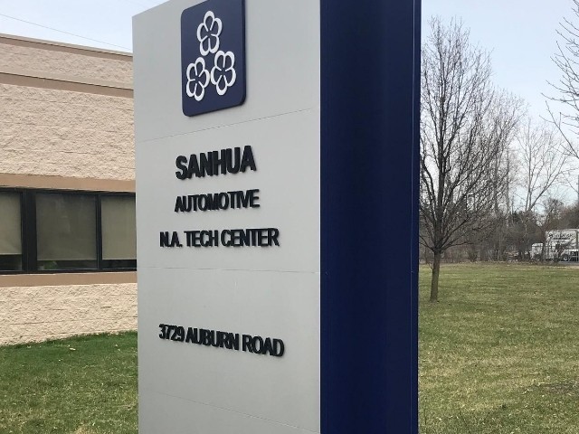
Sanhua Auto walked into our showroom looking for a sleek monument sign. They had a few ideas of what they wanted the sign to look like, which included the colors silver and blue. The sign also needed to be tall and skinny. Similar to GM, Sanhua is in the automotive industry and their company is geared towards fuel efficiency. They were adamant about keeping the flower design at the top of the signage as well. To be sure we understood what they were going for, they crafted a 3D replica of the design, using toilet paper rolls! We loved seeing the creative way our customers show us what they want!
Project Overview
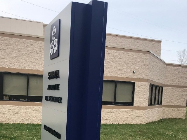
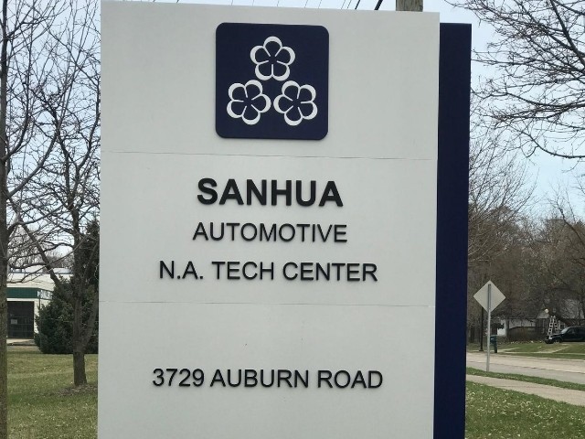
Along with keeping the design simple, Sanhua decided to make the cabinet sign non-illuminated as they are a smaller business that did not manufacture anything. This building was dedicated to more office space and did not bring in customers, so having an illuminated sign seemed unnecessary. The silver metal was utilized for the main cabinet of the sign. As requested, the sign was built taller, with a thinner body. The side was painted blue, and black dimensional letters were mounted to the body of the cabinet. To complete the monument sign, the logo of the company was arranged at the top, above the company name. This is where the flower piece is shown off.
Location placement of this sign was tricky due to the trees and set-back allowance from the municipality. Keeping within the set-back allowance from the road and away from the telephone pole, this left limited visibility. To be sure we got the best view, one of our team members went out with a mock sign and moved around the area that we were allowed to put the cabinet. This helped our team and our client work together to find the best solution for the sign location!
The Result
Sanhua Auto loved the signage! Since then, they have reached out to us multiple times, including ordering interior signage!


