Mobile signs like trailer banners are fantastic tools for maximizing exposure to your message. If you use them purposefully, they can give you the ability to reach an incredibly broad audience. But to make the desired impact, you need to pay attention to their design.
In short, this means customizing the sign from start to finish. To help you out, we will give a breakdown of how you can attract attention with your trailer banner.
What are trailer banners?
Trailer banners are a brilliant option if you are looking for a mobile advertisement solution. These signs are usually budget-friendly while still being great at what they do. Sign companies make them by printing banners that they span and mount on an empty metal trailer frame.
But you could also attach them to the body of the truck with tension rods.
Best ways to use a trailer banner
First, you need to decide what you are going to use the trailer banner for. You need to make this decision before you can get to anything else.
Signs aren’t only advertisements. You can use them for a variety of purposes. Or even combine a few in one. If you can think of it, you can probably do it with your trailer banner.
Among others, below are some of the uses that we recommend:
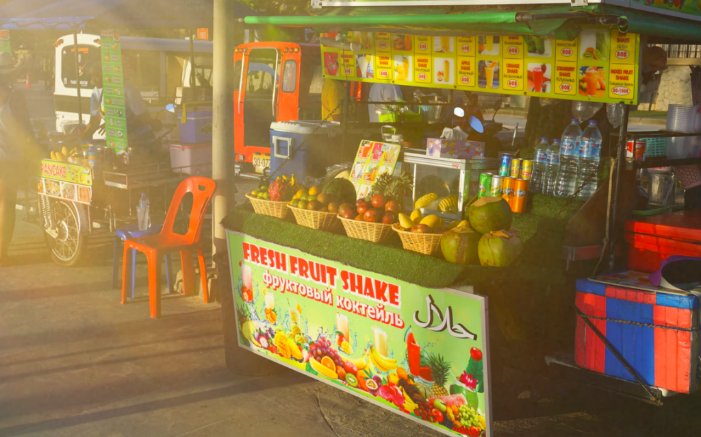
- Are you using your trailer as a pop-up store or stall at events? In this case, you can use the banner as a custom menu board for your products and prices. This saves you having to use an additional sign.
- As an alternative, you can use the trailer banner for promotional messages. You can advertise your business or specific products and services that you have on sale.
- Aside from this, you could potentially use the product as an informational sign at events at exhibitions. For example, you can use it to replace other more conventional conference signs. Note that this will probably work better outdoors.
- You could print directions for your storefront or office on the sign. This should form part of a more extensive wayfinding system. But it will only really work if you park it at a fixed location so that the directions will be accurate.
No matter what you want to do with your trailer banner, it’s important that you make it work for you. That’s where having a positive working relationship with your sign making company comes in. They will help you tailor the sign for your unique business or venture.
Top design tips for a trailer banner
Sometimes we all wish that creating a sign was as easy as copying and pasting a few bits and pieces together. But unfortunately, there’s more to it than that. Design is all about using distinct elements to create a coherent whole.
It’s both an art and a science. Luckily, there are many proven principles you can apply to attract viewers with your design and to tailor it for your trailer banner.

Visibility and readability
You should design trailer banners so that you can use them on the move and while standing still. Like all mobile signs, this means that you will face some unique design challenges.
One of these is to make sure that the critical details of the sign will be visible and legible in both situations.
Therefore, you should try to calculate the average viewing distance for most of your viewers. Once you know this, you can make sure that you use text and images that are large enough to be seen.
Informative graphics
You don’t want to overwhelm your audience with too much text. Doing this can only serve to confuse the viewers. As we’ve said, people don’t have much time to decipher the message, so you need to make the task easier for them.
Therefore, images can be a brilliant tool to help you communicate.
Don’t make the mistake of thinking that graphics are only there for their looks. Yes, they should make the sign more interesting and appealing. But you should avoid using images only for their appeal. They should serve a more practical purpose too.
For example, if you own a construction company, use photos that help bring this across like scaffolding or bricks.
The choice of using a drawing or photo is up to your personal preference, your brand, and the design.
But whatever type of graphic you choose, one thing should stay the same. You should only use high- quality, high-resolution images to make them more effective.
Memorable message
Although you don’t want to cram the design with text, you still need to use some. Typically, most signs need at least a few lines of words to make the message clear. In some cases, all you need is to include the name of your company.
Instead of boring the audience with too many words, you want to use as little of them as possible. And you want to make those memorable and punchy. If your viewers can recall your ad, even vaguely, it’s far more likely that they will stop by your business or give you a call.
The key to this is rewriting. You should experiment with different ways to say the same thing and challenge yourself to make it shorter and shorter.
Think of this. The average adult reads about 250 words per minute. Roughly speaking, this means about 4 per second. Most people spend about 8 seconds looking at a sign. However, if they are driving or if the board is moving, this will undoubtedly be even less.
So even in an ideal situation, you can only use 32 words, about two sentences but preferably you want to use far fewer. Even these two sentences with 32 words seem long.
Effective layout
One of the most significant aspects of the design is the layout. In other words, the way the content on the sign is arranged or set out. Among others this includes the:
- Text
- Borders
- Images and graphics
- Empty space
- Shape and size of the entire sign
Thankfully, there are several golden rules that you can follow to help you organize the design.
First, remember that as we’ve said, empty space is a crucial part of the layout. Less is more. You should never try to crowd every inch of the trailer banner with content. Doing this will only make the message less clear and the overall effect unappealing.
Second, you need to be clear about the focus of the sign, for example, a specific product. You need to make this the focal point. A few ways to do this is through using the relative scale of the elements, colors, and images.
Third, design experts recommend that you divide the layout into grids. You can use this to apply other principles. But importantly, it can help you to arrange the text neatly and with equal spacing.
Fourth, you can apply the rule of odds. Generally, appealing compositions tend to have an odd number of objects in the foreground.
There’s always more to learn about designing layouts. But with these principles, you should be able to create an impactful and appealing arrangement without much effort.
Palettes that pack a punch
Colors are a critical part of how most of us see the world. We can use them to communicate information and even affect people’s emotions. Therefore, it’s no surprise that they are critical resources for marketing and signage.

The requirements for choosing a palette are:
- The colors should catch the eye, perhaps thanks to their brightness, contrast, the combination, and so on.
- You should use some contrasting colors if only to separate the different parts of the sign like the text from the background.
- The palette should complement your branding even if it doesn’t match it exactly.
- Preferably, the color scheme should include 3 to 5 distinct colors or shades of different colors.
- Your choice of colors should facilitate the legibility and visibility of the content, not detract from it.
Before we go further, remember that this doesn’t mean that all the colors need to be bright and bold. You don’t want the design to be garish. And sometimes a soft and muted palette can be breathtaking.
Size and shape
Due to the nature of trailer banners, you have endless options when it comes to its size and shape. Depending on the situation, you can often customize the trailer for your requirements, otherwise you can more easily adapt the banner for the vehicle.
You could perhaps use one single banner all around the structure. However, it usually works better to create and install several smaller ones.
Generally, the most common shapes are rectangular and square because this will suit most trailers.
Things to consider when deciding on the size and shape of the trailer banner are:
- Cost of the product
- Total weight
- Mobility
- Visibility
- Sign companies capabilities
- Future location and use
- Amount of content
Placement of the trailer banner
The best part of vehicle ads is that they can go virtually anywhere you go. It can almost become like your shadow.
Are you going to the mall?
Or to the doctor’s office?
If you want to, you could always pull this ad with you as long as there is enough space at the destination. This will give you exposure for your business as you travel.
What more can you ask for?
Besides this, you can also leave the trailer banner parked somewhere as long as local rules and regulations.
No matter where you place it, you should be able to gain some benefits from it. But there are some locations where you can maximize its impact.
Although many people overlook this, deciding where and how to use a sign is a key part of the design process.
Here are some of the best places, times, and ways to use custom trailer banners:
- You can park the trailer in the parking lot of your office or storefront. Or even on the sidewalk in front of your physical location. This can be a great way to draw attention to your business and show people where to find you.
- Besides this, you can take the trailers with you to both B2C and B2B events like exhibitions. They can go towards making your stand more impactful. Or if you park it in front or in the parking area, you can inform viewers that you will be there.
- Drive around your local area with the trailer. This can form part of your neighborhood marketing strategy. Typically, most of your customers live nearby.
- Use busy roads like highways to your advantage. You can even drive around during peak hours in traffic for increased exposure.
Alternative solutions for mobile signs:
Trailer banners are undoubtedly one of the top options for mobile advertisements. For many business owners, these signs stand out thanks to their relative ease of use. Once you have hooked them to an appropriate vehicle with a trailer hook, you can simply pull them along.
There’s no need to set up when you have arrived at your chosen location.
But you might want to keep in mind that they’re not your only choice. Alternatively, you can use one of the following:
- Meeting and event signs
- Vehicle graphics or wraps
- Magnetic signs
- Tradeshow displays and exhibits
- A-frame sidewalk signs
Overall, it’s a great idea to combine different types of signage to optimize the effect. For example, you can use a custom trailer sign with a vehicle that has a matching wrap or graphic. Take a look at a similar job from our portfolio above.
Spreading the word about your business
Mobile signage, like trailer banners, can be brilliant resources for reaching out to your intended viewers. Their mobility can significantly improve the possible exposure and the potential size of the audience that you can reach.
Yet, as with any type of sign, you probably shouldn’t rely on one alone. Instead, it should form part of your broader marketing or informational campaigns.
To find out more about your different signage options, you can take a look at choosing the best sign material for an outdoor sign as well as a portfolio of clever outdoor event signage ideas.


