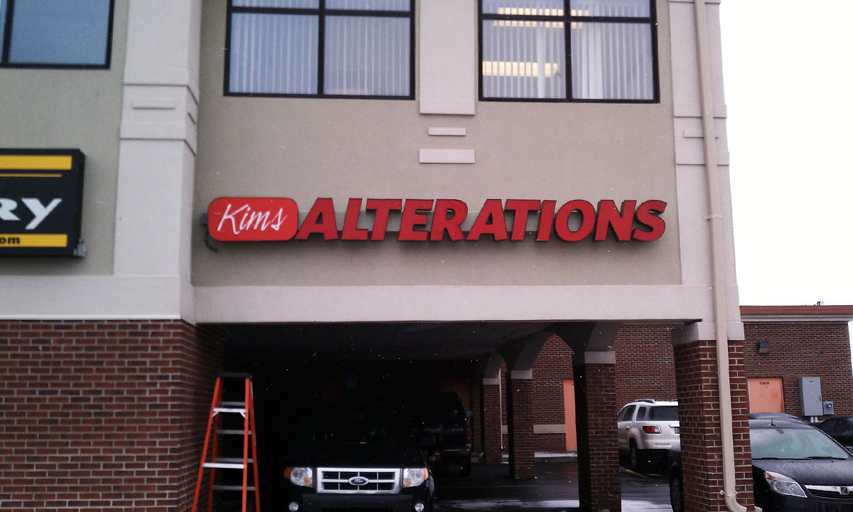
When the owner of Kim’s Alterations came to us asking for a way to increase her store’s visibility with channel letters, we were excited to help. We were asked to reflect the store while still staying within the budget.
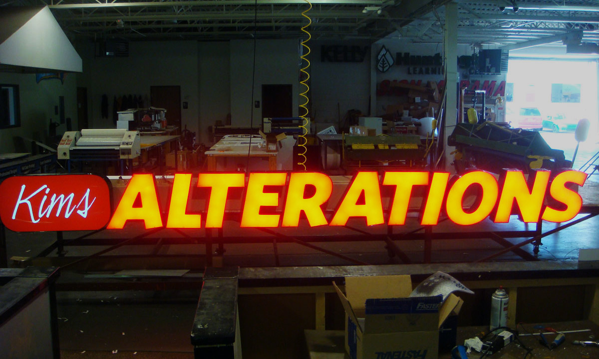
To help make this a reality, we turned to our experienced sign designers, and let them design a capsule sign with channel letters. This combination helped keep the total cost within budget, while maintaining separation between the words.
At the conclusion of the project, the sign looked great, displaying a reflection of Kim’s Alterations: beautiful, vibrant and businesslike.


