Much of visual design has practically been boiled down and perfected to a science. We are continuously learning more about how visual perception works and how people react to what they see. The use of colors is one of the elements of design that people are continually refining.
Professionals now use different shades more purposefully than ever before. All in all, one of the most critical aspects they consider is how you can combine them to get the best results.
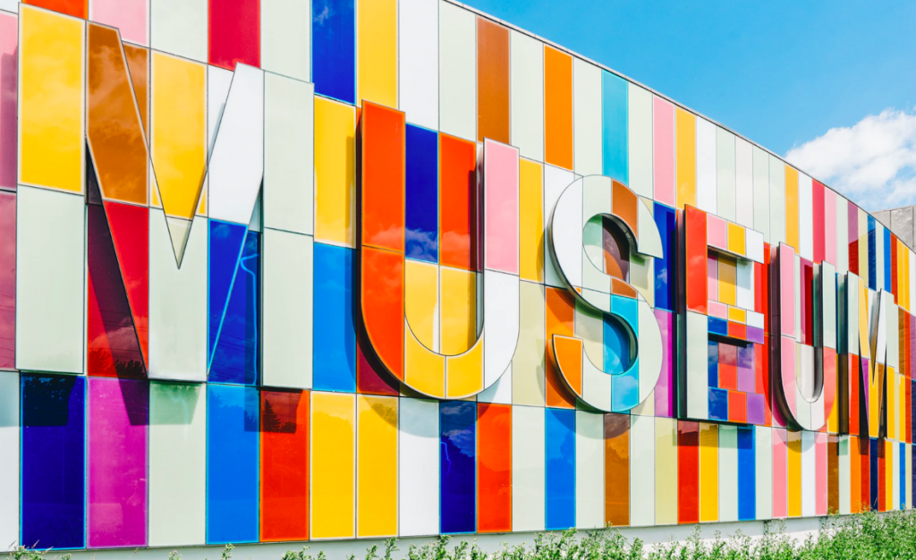
Luckily, this means that there is a wealth of resources available for business owners who want to create their own signage.
A rainbow
The first thing that you need to know is that nothing exists in a vacuum. We see every color in a context. In this case, we are specifically talking about all the different colors on a poster.
It’s great if you know you love blue, and you have decided that this will be the color of your brand. But when it comes to most mediums like signs, this isn’t enough. You will need to use different colors. Or at least different hues of the same ones.
Too often, people get caught up in picking one or two specific colors. And they forget to pay attention to the complete picture. Therefore, they might not pick up on clashing elements until the final stages of the design process.
So don’t get stuck on one shade. Instead, designers learn to think in terms of palettes. According to Lexico, it is the range of colors used by a particular artist for a specific picture.
An example of this is a brand whose color is primary blue – they can choose a palette for their advertisements and signs which include blue, gray, and white.
Always remember that using a palette is all about making sure that your design is attractive and coherent in the end.
Picking a palette
There are good palettes and bad palettes. In other words, there are visually appealing ones and ones that are not. By using the latter, you will unintentionally make your signs and other content much less effective.
You need to check that none of the colors will clash. The shades should combine well. Preferably each will enhance the effects of the others.
If they do clash, the signs might be unattractive, less impactful, less legible, less memorable. All of this means it will distract people from the content and can even leave a bad taste in the audience’s mouth.
To help you make the right choice consider each color combination from the following angles:
- Branding: A pro tip is not only to choose the primary color for your branding but to choose a whole palette. You can use this palette whenever you are creating content like ads and signs for your business. Even if the poster you are creating isn’t limited to these colors, it’s essential to choose ones that combine well with this scheme.
- Originality: It can be difficult to be completely original. But you should at least try to use schemes that aren’t so widely used that they become cliched. You still want your brand and content to be distinctive. For example, red and white are almost irreversibly linked to Coca Cola.
- Visibility and readability: Some color combinations can make signs more difficult to read or make out. That’s why you want to test this before you make your sign.
- Meaning and association: We associate different colors with different meanings. So each shade can have a unique effect on viewers. You want to try to use combinations of colors with similar or at least complementary associations.
Color theory
Color theory is a body of practical guidance to color mixing and the visual effects of a specific color combination. In short, it is about helping you decide how to mix and match colors on your media. This includes your signs.
These principles are the reason why professionals always seem to know what the best combinations are for specific applications.
The theories are based on both art and science. Combining the best of both is what makes these ideas so effective.
Down below, we will look at a few of the crucial concepts of the theory and how you can use them in your creations.
Color wheel
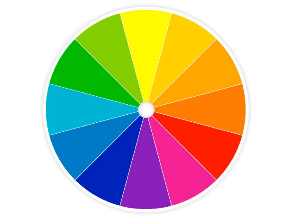
A central part of color theory is the color wheel. You probably remember a similar image from your days in kindergarten and primary school. Now it’s time to take a more in-depth look at it.
Sir Isaac Newton came up with the first color circle in 1666. He based it on the results of experiments where he passed white light through a prism. The glass refracted it into its constituent colors which are red, orange, yellow, green, blue, and violet.
Since then, artists and scientists have continued to develop on the idea. Therefore the wheels have become more and more complex.
But they are still a fantastic tool for combining colors.
There are three main categories of shades based on the wheel, namely primary, secondary, and tertiary.
Primary colors
You might remember these from your school days too. They are red, yellow, and blue. These are the three pigments that cannot be mixed or formed by any combination of other colors.
In a way, you can think of them as the originals. You can derive all the other colors from these.
Secondary colors
Secondary colors are the products of mixtures of the primary ones. They are green orange and purple. You can see that these new shades fit in between the original ones on the wheel from which they were formed.
Tertiary colors
On the other hand, you get tertiary colors from a combination of primary and secondary ones. The six are red-orange, yellow-orange, yellow-green, blue-green, blue-violet, and red-violet.
Color harmony
Your main goal in choosing color combinations will probably be to create an image that is as appealing as possible. For this reason, you want harmony, which is a pleasing arrangement of parts.
Not everyone might know the scientific or psychological reasons why they dislike certain color combinations. But it is clear that viewers have a strong dislike for some of them.
One reason is that humans do not like schemes that are boring. If the colors are too similar or muted, it won’t necessarily catch the eye or interest you.
However, it can be even worse when they are too chaotic. This is another reason why we feel a strong dislike for specific palettes. If there are too many colors and particularly too many conflicting ones, it becomes overstimulating. In those cases, images can be difficult to look at and understand.
Therefore, you can say that we dislike schemes that sit on either side of the spectrum. Instead, people tend to prefer palettes that sit in the middle.
You want them to be visually interesting. But you also want the image to look well-ordered and coherent. So it is all about finding a balance.
Combinations
So why do I need to know all of this?
You can use the color wheel to figure out combinations that will work well together in different situations. In fact, this is how people found many of the matches that have become classics.
It is all about pairing different shades based on their separate positions on the circle.
You can use one of these combinations to choose the palette for your sign. Or you can mix and match them to create the perfect picture.
Let’s look at some of the critical schemes that any professional or amateur designer should know about.
Analogous
The first scheme we are going to look at is analogous. The term refers to three colors that sit side-by-side on a 12 part color wheel. For example, you can make up a scheme from yellow, orange, and red.
Overall, the colors in this combination will look more similar than those in most of the others.
Designers typically choose one of these hues as the dominant one in the image or design.
Complementary
Another of the critical combinations is complementary colors. The term refers to hues that are directly opposite each other on the wheel. They contrast with each other yet do not clash or conflict.
An example of this is choosing blue and orange.
You will usually use this scheme with another like analogous, which is more harmonious.
Natural
Nature is often the perfect picture of harmony. As humans, we are often awed at the beautiful color combinations around us. It is no wonder that artists commonly draw inspiration from natural elements like fauna, flora, and scenery,
The color schemes will typically work wonderfully for design too.
Unlike the other combinations, you can’t use a set out a formula based on the wheel. Instead, you use things like flowers as a reference.
Monochromatic
If you are looking for a subtle and conservative palette, you might want to choose monochromatic colors. It’s one of the most harmonious combinations you can find.
For this type of scheme, you can use three shades, tones, or tints of one base color.
Because it is more harmonious, it is incredibly versatile.
But to make a sign more interesting, you might want to combine it with another scheme. Or add one or two distinct base colors.
Triadic
You can also use triadic colors. These involve three hues that are evenly spaced around the wheel — for example, violet, orange, and green.
The combinations are of high contrast. So they can help you create a bold image.
However, they are less contrasting than complementary colors and are more harmonious.

Tetradic
The next combination works similar to triadic schemes. Yet instead of three colors, it is based on four that are evenly spaced on the wheel.
Overall the ideal way to use this palette is to use one hue as the dominant one. You can then use the others as accents. Just be aware that the more colors you use, the more challenging it can be to balance.
Good color combinations
All of the color schemes above can work well for the palettes of your signs. So they are all options that you should consider.
The top combination that you can use is mixing analogous and complementary colors.
To mix them you want to use the former to cover the majority of the sign. On the other hand, complementary colors work best for text or specific spots that you want to highlight. It is a great way to help you make these elements stand out.
No matter which palette you choose, a good rule of thumb is to use the 60-10-30 rule. The main color in your palette should occupy 60% of your design, the strongest color 10% and the complementary color 30%;
Don’t worry if you don’t get it right the first time. Even professional designers needed to gain practice and knowledge to make these decisions. That’s why it’s always good to ask for an expert’s opinion or advice.
A pro tip is to test your design. Colors will probably look a bit different once you have printed them. So ask you sign company for a mock-up of the sign before you finalize it.
Bad color combinations
Overall, it’s when you stray from these classic combinations that things can go wrong.
Any designer worth their salt knows that neutral colors can work well on signs. However, you want to stay away from only using muted colors. These will undoubtedly cause your sign to lean towards the understimulating and therefore uninteresting side of the spectrum.
The same counts for using only colors that are too similar to one another.
Besides this, one of the worst combinations is vibrating colors. This refers to a phenomenon that emerges out of bold and highly saturated color schemes. The edges of two directly adjacent colors appear to merge, blur and glow, giving the illusion of motion.
Examples of these are:
- Orange on blue, and blue on orange
- Green on magenta, and magenta on green
- Cyan on yellow, yellow on cyan
- Magenta on blue, and blue on magenta
Painting a picture
Choosing the different colors to mix and match on your signs isn’t simple or straightforward as we might wish it to be. There is a lot of thought and care that goes into creating the perfect palette.
But in the end, it will pay off when you have created an appealing and effective sign. Its an essential element of all signage that you need to use in combination with others to make it as eye-catching as possible.