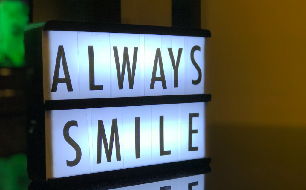
There are many different ways for you to reach your customers and clients. Naturally, we think signs are a great method. (Though we might be a little biased, of course). But even once you decide to use a sign, there are still more options to dig into since there are plenty of sign options to choose from. One of those options is illuminated box signs.
Once you’ve zeroed in on illuminated box signs, we can dig still deeper and think of some ways to use these signs that aren’t run-of-the-mill. That’s what we want to do today—give you some fresh ideas. Then, we’ll follow up with some illuminated box sign tips.
1 – Double it up
We may typically think of monument signs when we think of signs with brick faces. But there’s no reason you can’t create a hybrid sign using brick and an illuminated box sign. Do this by placing an illuminated box sign on the face of a brick monument, retaining wall, exterior building wall, or other brick surface. Check out this black lightbox against brick. This hybrid option could be a great way to balance the man-made look of an acrylic sign with a more organic-looking material like brick.
2 – Use illuminated box signs inside
Need an outside-the-box way to help customers and clients find their way around your office space? Well, an illuminated box sign could be just the thing. You can use one to point the way to the restroom.
Or, if you have in-house dining options, you can craft a sign that announces your presence. While you could mount it on the wall outside your cafe, you could also find a more creative way. For instance, check with your sign specialist whether you can suspend it on a cable for extra visual impact.
3 – Set up illuminated box signs in unexpected ways
A natural inclination might be to think of attaching illuminated box signs to poles or affixing them to buildings. However, come up with creative ideas for displaying your sign instead. Try some ingenious options that highlight what your company does. For example, if you’re a laundromat, maybe you can find a way to craft an illuminated box sign that will sit atop an antique wringer washer instead of being supported by a pole.

Or if you’re a pizza place, use stacked pizza boxes as the base for your sign. Naturally, you’ll have to get durable pizza boxes designed for this. No cardboard, please—it would really take a beating if it happened to rain.
Once you’ve dreamed up some possibilities, run them by your sign specialist for input. (Note: you should also check into the rules and regulations about signage in your locality to make sure the display method you choose is compliant).
Tip – Vary the mood of illuminated box signs
Try to fit your sign to the type of work you do. This could give customers an idea of what to expect from you before they even walk in your door. Plus, it could help create a cohesive brand image for your company.
Filling up your sign face with color and whimsy for a happy, upbeat look could be perfect if you specialize in creating joyful experiences for your clients. That could apply to children’s museums, ice cream shops, restaurants, or trampoline parks, for instance.
On the other hand, some businesses will need to strike a more professional, reliable tone with their illuminated box signs. They may choose more neutral or calm colors, and they may select different fonts to help them achieve this look.
Even your sign’s shape could help you create the appearance you’re going for. Does a rectangle, circle, or square best suit your needs?
Tip – Think it through
Once you purchase and pay for your illuminated box signs, you’ll probably want them to work for you for a while—to pay off the investment, so to speak. This is actually a good argument for why you want to think your design through ahead of time. There’s no sense in cobbling something together without much thought, then regretting it later. If necessary, you can even get expert advice for this—maybe by using your sign specialist’s design services if offered.
Tip – Consider your location
Ask yourself where this sign is going to be placed. If you know this ahead of time, you can plan your design accordingly. For instance, if it’s placed on an otherwise empty exterior wall, you may want to think about creating a striking appearance against the wall yet not clashing with the current wall color.

Plus, you can also think about the lighting situation wherever your sign will be. Will you have plenty of natural light or artificial light round the clock? Then, you may not need a brilliantly-lit sign. On the other hand, if there’s going to be a dearth of light once the sun goes down, take that into account.
Reach the customer
Create a sign that’s going to catch customers’ eyes and also give them a positive impression. And, as you make your plans, remember to take into account who your customers are. Exactly who are you trying to reach, and what might appeal to them? Get started planning the text on your illuminated box signs with our 10 Professional Sign Fonts + The Meanings Behind Them.


