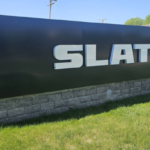
Believe it or not, choosing a font can be the most daunting parts of designing signage. There are thousands to choose from with new ones added every day. However, you should know that not all fonts are equal.
You need to put careful thought into choosing the typography for your signage. Read on to find out about the best professional fonts to use on your signs. To help you avoid mistakes, we’ll also look at ones that you should avoid at all costs.
Guide to fonts on signs
Thankfully, there are fundamental principles that can help you make the right decision.
We often want to gravitate towards the more exotic typefaces. But interesting isn’t always the right choice. There is a reason why companies use some fonts over and over again.
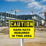
Above all, you should pay attention to the visibility and readability of the sign. Unfortunately, too many people choose typefaces that are almost illegible. It benefits no one if your audience can’t read the sign.
You need to be wary of thin letters, script, and ornamentation.
Remember that research has shown that people only spend about 3 to 7 seconds looking at digital signs or perhaps up to 8 seconds with other signage.
In saying this, you still want the words to look good. Part of this is to avoid using fonts that have been so overused that they’ve become cliche.
Additionally, you want to use typography that fits into your brand identity. That’s why you don’t want to use fonts widely recognized as “belonging” to a specific company.
Fonts to avoid
Now we’ll get the bad news out of the way first. Here are six examples of typefaces that you should avoid on your sign. They don’t work for a variety of reasons.
Comic Sans
Let’s start with the notorious main culprit for an overused font, Comic Sans. This typeface has gotten quite a bad rap over the years. It’s creator Vincent Connnare designed the font for a children’s software program. From there it spread like wildfire. That should give you a hint at the problem.
So not only has it become cliched, it is child-like too. Never, ever use it for any critical or formal communication. People won’t take it seriously.
Because of all this, your audience will usually associate Comic Sans with amateur graphic design. It can, by extension, make your business seem less professional.
Papyrus
The celebrity of bad fonts is undoubtedly Papyrus. It’s one of those faces that many of us feel a bit ashamed about having used one time or another. You will find it all over anything to do with Egypt and the Mediterranean.
And now it has forever been linked to James Cameron’s Avatar. If you use this on your sign, you risk looking unoriginal.
All this aside, Papyrus isn’t very attractive nor pleasant to look at.
Don’t be tempted by the exotic quality of this typeface. Just leave it in the past where it belongs.
Curlz
You can’t get much more whimsical than Curlz. It is beloved by many little girls for its fantastical ornamentations. Bakeries, toy shops, and kindergartens often feel that Curlz can help give them that playful character. But sometimes there is something like too many curls!
Sadly, this “happy” font can look immature and too flashy.
Above all, it doesn’t translate well to signs. The ornamentation can make it more challenging to read, especially if your audience sees it from a distance.
Brush Script
Flowing or script fonts are always popular. But you have to be extremely careful in using these on signs. They are undoubtedly less legible than other typefaces.
However, this isn’t the only problem with Brush Script.
The typeface was in its heyday in the 1960s and 1970s. However, designers in all types of industries used it for decades before and after. That’s why it holds some nostalgic appeal for people.
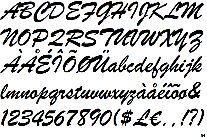
However, it is better to avoid this piece of the past that people have revisited too often. You would be better off looking at the variety of newer typefaces that are made to have a vintage feel.
Courier
Courier is a widely used serif font. Similarly to Brush Script, it has one of those typefaces that has a vintage feel. It resembles the typesetting for typewriters.
In general, Courier can still work well for other types of media like plain text documents. Compared to some of the alternatives, it is quite legible.
But it doesn’t work for signage. You might be able to read it. However, that doesn’t make it exciting or appealing. Besides, it mostly looks outdated and behind the times.
The best fonts for signs
Now that the bad is out of the way, we can get to the good stuff. Thankfully, there is a cornucopia of different fonts that designers can choose from. No doubt, you can find the ideal one for your business’ sign.
We’re going to look at ten of the top professional fonts to use on different types of signage.
Helvetica
If you know anything about graphic design, you have probably heard about Helvetica. It’s a great all-rounder sans serif font. Overall, it looks neat, professional, and easy to read. It looks attractive too.
Because of this, it is hugely popular. You can use it successfully on all kinds of platforms, including signs.
One downside of its popularity is that it doesn’t look as original or unique as it once did. Nevertheless, it will still make a sound choice for your sign.
Helvetica doesn’t necessarily evoke strong associations or emotions, so it gives you the chance to create meaning with it.
Bodoni
Another excellent font for signs is Bodoni. The typeface is exceptionally stylish. It’s a serif design with contrasting thick and thin lines that creates a wonderful aesthetic.
In the end, it will convey to your audience that your business is sophisticated and modern. Bodoni looks professional as well.
All things considered, it can be a great choice for you if you own a classy restaurant, cafe, or retail store like a boutique.
Boomerang script
In the list of the worst fonts, we gave playful and script fonts quite a bad rap. But this doesn’t apply to all of them. Some of the most exciting and engaging fonts combine both of these like Boomerang Script.
You can buy it in a bundle that comes with uppercase, lowercase, and hand brush style characters.
Boomerang can help you to make your business look fun and creative above anything else.
We think that this font will be ideal for a burger shack or any other hangout spot.
Some people might be put off by the fact that they will have to buy the font bundle. However, if it suits your brand identity and vision, it should be worth it.
Gatsby
Bodoni is by no means the only choice if you are looking for a sign to show your customers that your business is stylish and elegant. Gatsby can be a brilliant alternative too.
Unlike Bodoni, it is a sans serif font. Gatsby’s characters are elongated and thin. Altogether, it looks very tasteful and professional. It’s an excellent option if you want a typeface that looks vintage but not outdated.
You need to note that Gatsby only has uppercase letters. But this means that it stands out even more.
In general, it’s perfect if you are designing a sign for a luxury retail store.
You can download it in a bundle with single weight and four additional styles normal, outline, retro, and distorted.
Indigo
Next up, we are going to look at another sans serif font. Indigo stands out from the previous options on the list for its bold characters. It’s a combination of the ‘Indigo Regular’ and the outline version ‘Indigo Outline.’
The mix makes its letters chunky and thick. Thanks to its curvy shape, Indigo looks edgy and casual, but by no means amateurish.
You can use it on your signs to let them know that your business is contemporary and fun.
Indigo is quite versatile. And it’s one of those fonts that look just as fabulous in lowercase as in uppercase.
Luna
The next typeface is a fantastic alternative to more overused stencil fonts. You can buy the font in a bundle that comes with a version without the stencil-like effect or the stylish version that comes with these elements.
Luna is a slab serif typeface which means that the designers created it with thick block-like serifs. Its letters are quite angular and straight.
We think that this font will work brilliantly for a camping, or hiking store or something similar. Your audience will interpret the sign as saying that your business caters for people who love adventures like experiences the outdoors.
It is the right mixture of rugged with a bit of polish that will make your sign stand out from the crowd.
Futura
Opinions differ widely on the use of this font. Some designers feel that it looks too stiff and that it’s no longer original.
But others still adore its minimalist style.
Paul Renner created the font and released it in 1927. In the spirit of Bauhaus, he based the design on geometric shapes like circles, triangles, and squares. It’s a credit to its creator that Futura looks progressive and contemporary today.
All in all, you can use this typeface on your sign to tell your audience that your business is efficient and forward-thinking.
Modeka
Another option if you are looking for a minimalist font is Modeka. The letters of this typeface are clearcut and also geometric.
However, where the geometry of Futura is more understated, that of Modeka makes a bold statement.
By using this font, you will let everyone know that your business is creative, unique, and certainly edgy.
Best of all, you can get it for free.
Garamond
Garamond is a very popular font for bodies of text like textbooks, magazines, and websites. However, you can use it just as successfully for your signs too. It’s a serif font with a timeless aesthetic.
There are several versions of Garamond. For signage, it can be a good idea if you choose the bold version of this font to make sure it is clearly legible.
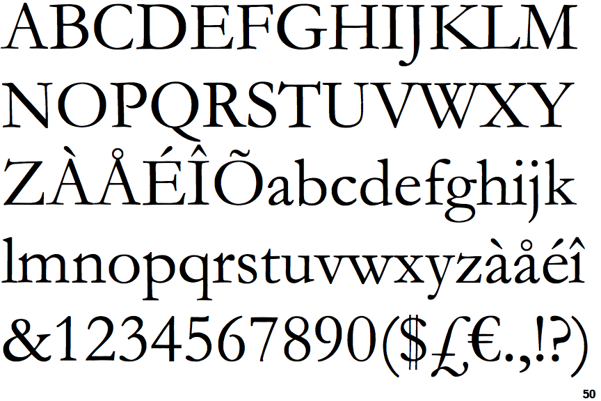
The font has quite a long and rich history that dates back to the original versions that were designed by the 16th-century Parisian engraver named Claude Garamond.
By using the typeface on your signs, you can suggest to your customers that your business is reliable and trustworthy.
Buttermilk Farmhouse
Buttermilk Farmhouse is another wonderfully whimsical font. It is a hand-drawn calligraphy script. You can get it in a bundle with multiple versions which each put a unique twist on its aesthetic.
Undoubtedly, rustic chic is in vogue. Whether it is home decor or sign design, people go nuts for this style. So if that is the look you are going for Buttermilk Farmhouse might be the font for you.
The homely textured style still looks soft and delicate. With this charming font, you can let your customers know that your business is relaxed but yet stylish. That is why this typeface is excellent for a cafe. But it works wonderfully for something like a farmer’s market as well.
Say it right
The most important idea in signage is that it is not just about what you say, but how you say it. Experts know how important it is to choose the right professional font to use on your sign.
You need to make sure that its meaning and association enhances your image and identity instead of clashing with it.
Remember to always ask your sign making company for their opinion and advice.
The font you use is one of the crucial elements and terms in design. But if you want to create signage there is far more you need to know. Take a look at our article on sign terminology: negative space, optimal distance, typography & more.