Creating the perfect event registration signage is a critical step in putting on a successful event. You know it needs to be visually appealing, but it also needs to be informative and have easy-to-follow instructions on where to go and what steps guests will need to take to properly register. On a practical level, if guests can’t find the registration desk, well, they won’t be able to attend the event!
Creating the perfect event registration signage
First, let’s address the all-important (and often confusing) subject of creating the right signs to steer people in the right direction – toward the registration desk.
Outdoor signs for event registration
Especially if your venue is large, you’ll need plenty of signs to hail your guests even before they park their cars. Setting up A-frame sidewalk signs on the curb outside and on the street corners will help direct your guests to the right building.
Next to the door you should set up another sign to assure people they are at the right place. This sign can and should be tall and imposing, with the basic and essential information about your event.
Indoor signs for event registration
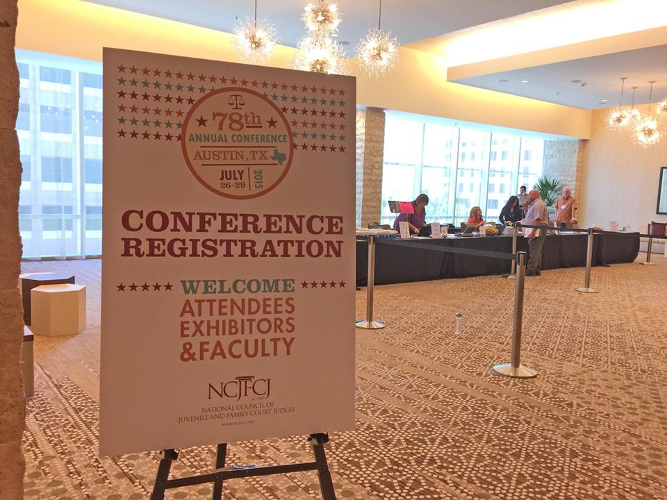
Indoor signage – a lot of it – is important if the venue is large or the registration desk is down the hall or in an entirely different part of the building. Put a sign at every corner with arrows showing which direction to go. But first, when people walk in there should be a sign giving them a little more information and pointing them to the registration desk.
Finally, set up the perfect event registration signage near the desk itself! If you’re expecting large crowds, putting up signs that will direct guests to line up in an orderly fashion can be a huge help. Next to the door you can put up a tall sign that provides even further information on the event. And above, you might consider hanging banners that confirm that this is indeed the registration area.
To the best of your ability, barring any personal mistakes the guests make, you’ll need to make sure that their registration experience is smooth and easy to understand. Having the proper signage can take a lot of the weight of the responsibility off of you and your staff.
Designing the perfect event registration signage
Now let’s take a look at some examples of event registration signage to get you inspired.
Go bold or go home

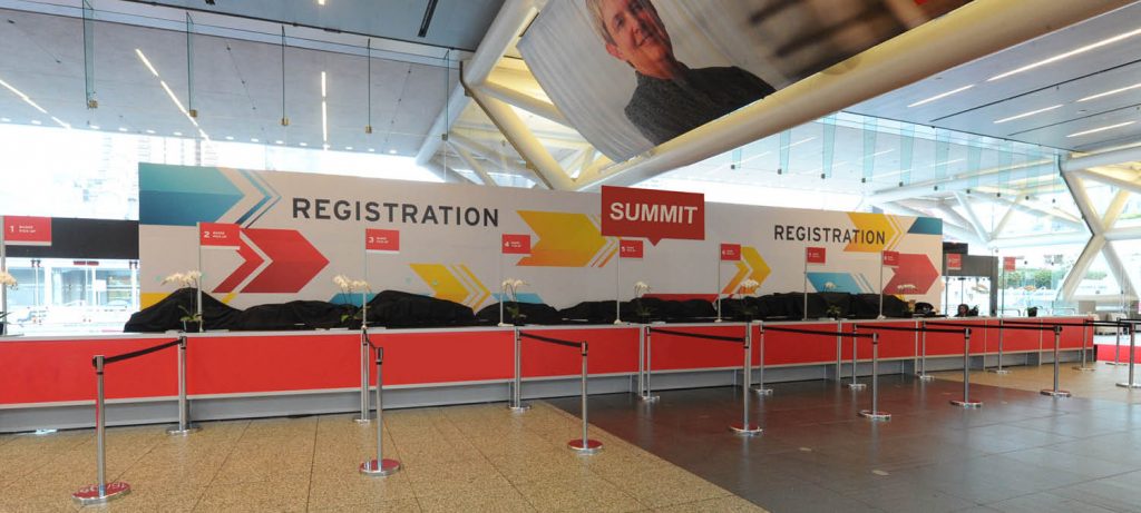
Big, bold colors go a long way when designing event signage. Large signs that have bright, clean colors will help draw the guest’s eyes. It’s also best to go minimalist. You want your signs to provide guests with the info they need, but too many words or (worse) tiny print will slow people down. This could only lead to more confusion if they decide to skip reading the information altogether. Words need to be easily seen from a few feet away.
Minimalism is key

See how this convention sign is wonderfully minimalist, while still being eye-catching? People can clearly read the text, follow the arrows, and the bright, almost cinema vibe makes it hard to miss.
Creating a minimalist infographic feel for your signage can also be helpful. However, remember that minimalism is important, and don’t stuff your sign full of information. Keep it clean and sharp. Also, remember to use modern fonts that make your brand look as professional as possible.
Represent your brand
Let your event registration signage represent your brand. This advice is helpful whether your event is a business conference, a school conference, or anything in between. If people know your logo and they see it on your signs, they’ll immediately make the connection. Even simple things like certain color combinations help define your brand. If you’ve created a hashtag on social media for your event, make sure to include that on your registration signs so people will know to use it when they post on social media.

Create an event to be remembered
Pull off your event registration with efficiency and great visual appeal and guests will remember your event with pleasure. And if your event is annual, they’ll want to come back next year! Step out of the box, design something really special for your event, and make it unique and practical. But don’t forget the basic principles of creating and designing compelling event registration signage that will guide and help guests along the way!
If you want to read more, check out unique designs for every kind of sign with tips to get the look and the best tips on how to mix and match colors on signs.


