In the restaurant industry, it goes without saying that one of your main goals is to connect customers with food. And what better way to reach customers with your delicious food than to bring it to them? That’s one of the advantages of a food truck—you can drive those tasty offerings to the customer instead of the customer having to come to you. Of course, just like a brick and mortar restaurant, you’ll still need to think about having an appealing design and a useful menu. So today let’s explore food truck menu design.
Lead with legibility
While legibility may seem remarkably obvious, it’s a good place to start anyway. You want potential patrons to be able to read your menu. After all, who wants to stand out in front of your truck trying to make out what their options are? Better to have them spend time agonizing over which delicious-sounding option to choose than painstakingly try to decipher what their options actually are.
So, be sure your menu isn’t an illegible scrawl. And make sure your words are large enough for patrons to read. You probably don’t want people squinting at your sign either. Even if you’ll be spending most of your time inside the food truck, check and see how things will look from the outside since that’s where your customers will be.
Find examples of good food truck menu design
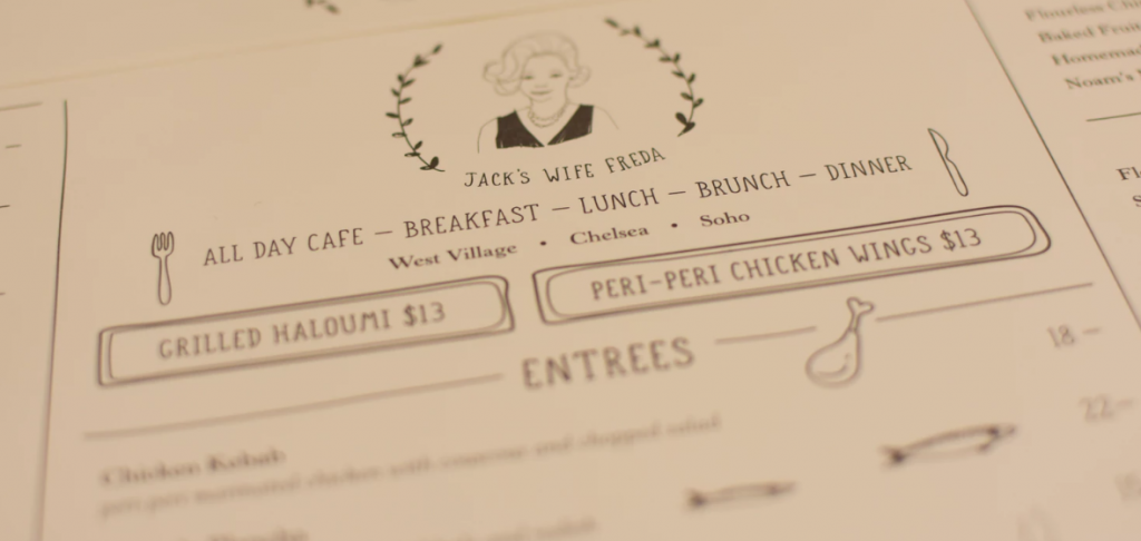
One step you could use as you design your menu board is to gather inspiration from other menu boards or menus. Find examples you do or don’t like. You can use them to help you think about why you’re drawn to or repelled by certain things. Then, use that knowledge and those preferences to inform your own food truck menu design process.
As you learn from other menus, pay attention to differences you see in fonts and line spacing. Also, consider researching the readability and attractiveness of certain fonts (including what fonts are best for people with vision difficulties).
Promoting with pictures

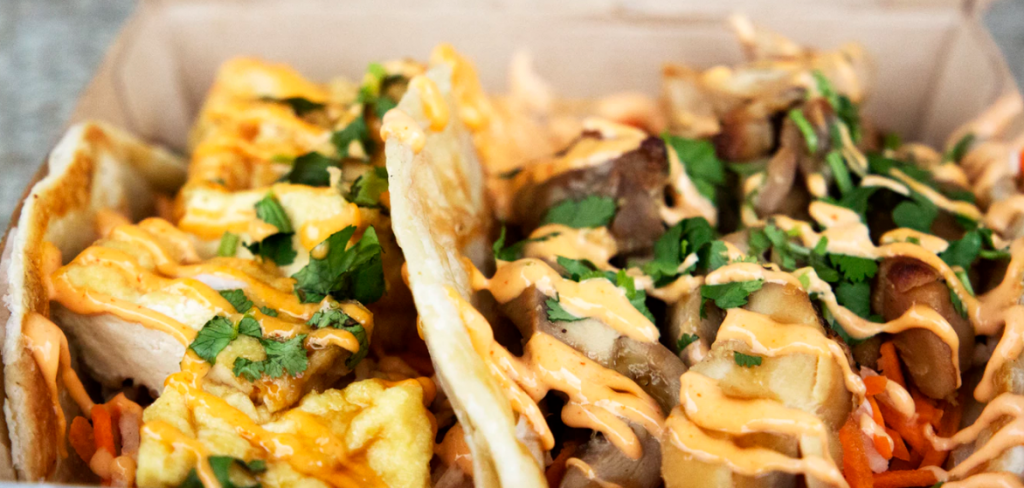
If you’re going to be using photos on your menu board, you may want to hire a professional photographer because you want your food to look it’s very best. And you surely don’t want to make your food look drab or disgusting by using low-quality photos.
Place properly
Also, make sure you place your menu board in a good location—whether it’s on the food truck itself or on a standalone sign. Of course, you don’t want it to be hidden from view. Instead, you want it to be easy for customers to see and read.
Additionally, you don’t want your sign to be too high or too low. If your customers get a sore neck from weighing their options, that’s not exactly good design, is it? On top of this, be sure that when you place your sign, you’re in the clear according to any rules for the municipality you’re in.
Coming to colors
Next up—making food truck menu design choices that have to do with color. One thing you may want to do is choose colors that match your branding. That way, you’ll be working toward a unified look. If you don’t have a logo yet for your business, you may want to come up with one now, matching it to the aesthetic of your menu.
Formatting for the long term
When it comes to masterminding the layout of your menu, consider going with something that can be sized up or down. That way, if you want to use the same layout for individual menus or even for a large menu board (if you also have a brick and mortar location), you can. Then, you may be able to save yourself from having to format a new menu for either of those needs.

Where does it go?
One thing you’ll have to decide is where this food truck menu will be. Will it be a part of the food truck itself or something you stow away then bring out at the start of every day?
- Your truck as your menu – If your menu is going to be emblazoned on the truck, then it may be time to check out our vehicle graphics.
- A standalone sign – Don’t want a food truck menu design that calls for writing on your truck itself? That’s okay, you may be able to use an A-frame sign to get the job done.
- Magnetic signs could also be a way to present your menu on your food truck. However, we do suggest you think carefully about your design if you opt for this. You don’t want to appear tacky.
And keep in mind that you may choose more than one sign. For instance, even if you have an on-truck menu board, you could display an A-frame sign too, letting customers know about the daily special.
Steer clear of B-grade
It’s time to explain to your food truck customers what it is you have for them to eat. Don’t just scratch your offerings on pieces of paper and poke it out the food truck window. Put some thought into your food truck menu design with expressive graphics. Integrate your menu with the other design elements of your truck for a cohesive and memorable look. Then check out our Tips And Tricks To Creating The Most Effective Signs For Marketing for more ideas to reach your customers.


