Indoor directional signs are a staple of most businesses. Whether you run an office park, a hospital, or a small hobby store, they can be incredibly useful to help customers find their way.
As with any sign, there is lots to learn if you want to use them effectively. We want you to love signs as much as we do, so here is our list of facts you didn’t know about indoor directional signage. It will cover the useful, interesting and everything in between.
What are indoor directional signs?
Before we dig into all the crazy facts, let’s get the basics out of the way.
Indoor directional signs are also called wayfinding signs. Companies use them to inform people and help them to navigate their way through their surroundings. Remember that this will help your staff too.
The larger the business and building, the more important these signs are as it will be more challenging to find anything.
So when are directions necessary?
There are some key spots that you should always point out like:
- Restrooms
- Emergency exits
- Safety, first aid, or fire equipment
- Stair, escalators, and elevators
- Entrances and exits
- Reception or check-in desk
- Different departments in the business
- Main offices
- Parking
- Dining area
- Lobby
- Client services
- Cashiers
- Help desk
- Conference rooms
- Landmarks
- Points of interest
Of course, different types of organizations will have different requirements. For example, a gym needs to give directions to the pool and sauna. So just ask yourself what areas are essential in your location and company.
In general, indoor directional signs are some of the most important indoor signs for any business.
1- Design of directional signs
Did you know that the design for wayfinding signs are different from that of any other?
Keep in mind that its purpose from that of other types. These aren’t the ‘celebrities’ of the signage world – the flashy and extravagant advertisements, and promotions.
By extension, well-designed directional signs can help promote and improve the reputation of your business. But that’s not the primary aim. You want to aid in navigation and the design should reflect this.
In this case, less is more. This is often a good principle with signs. However, it’s even more crucial with directional signage.
The directions on these signs should always be clear. You don’t want to obscure it with unnecessary details or even graphics.
Besides this, you want the boards to be noticeable. Yet they shouldn’t be distracting. Instead, they should fit in with the rest of the environment and complement the overarching theme or decor.
2 – Choose user-friendly language
The emphasis on simplicity should extend to the actual content of the signs. You want the text and the graphics to be easily understood.
There should be no ambiguity, misunderstandings, or guesswork involved. Confusion will defeat the purpose.
To do this, you should:
- Avoid any descriptive or flowery language
- Don’t give instructions – you can have additional signs for this in the relevant spots.
- Stick to one or two words. Only provide the name of the location like “main lobby.”
- Use symbols in conjunction with the text.
- Choose words that are easy to understand.
3 – Consistency is king
One of the critical principles of directional signs is consistency. Once again, this differs from many other types of signage.
The consistency involves the method you use to convey directions, the designs of the signs, the text formatting used. It’s a good idea also to keep the placement of the board more or less the same.

You should stick to this throughout your business, both inside and outside. The customers shouldn’t have to waste time figuring out what each sign is trying to say.
4 – Progressive disclosure
People often approach indoor directional signage in the wrong way. They often think of them in terms of a distinct and individual object. But directional boards are more than just signs. Wayfinding is a system.
Always think of directions as being a representation of the structure and organization of your business. In other words, they are part of a bigger whole.
Because of this, you should practice progressive disclosure. Simply put, this means that you should reveal information bit by bit. You don’t need to give all the information on one sign. This will leave your visitors confused by too many choices.
Instead, think of how you can guide them step-by-step. For example, put up a sign at the entrance to guide them to the reception. There you can place signs that give them directions to other parts of the building.
5 – All about the experience
Nowadays, customer experience has become a central part of business models and practices. And indoor directional signs can play an essential role in this.
You want to use this type of signage to help improve the experience of visiting your offices, store, or center.
Try to imagine yourself in your audience’s shoes. Working out customer journeys can be a powerful tool. You can adapt it to all the aspects of your organization, including how they navigate through the physical space.
The aim of doing this should be to make any visit as seamless and hassle-free as possible. Creating a positive experience will encourage customers to come back and entice new ones to take a look.
6 – Start before they arrive
No doubt, we are living in the digital age. The way most of us live our lives has certainly changed.
It can be quite a challenge to keep up with customer’s expectations but exciting too.
One innovation that will help you keep up is using integrated wayfinding systems. In short, this involves giving your customers info about the space long before they arrive. You are, in a sense, helping them prepare for their visit.
Here are key ways you can do this:
- If they are coming for an appointment, SMS or email them information on where to go when they arrive.
- Create a wayfinding app for your business. It will work particularly well for larger organizations like colleges.
- Publish a directory on your website or social media.
A pro tip is to use similar language throughout this system.
7 – In the line of sight
Part of the design process means considering where and how you are going to place the signs.
Will they hang from the ceiling? Do you want to mount them on the wall?
The best spots for directional signs are usually at eye level or above it. Doing this will ensure maximum visibility. Make sure that it is in people’s natural line of sight. And that the text and graphics will be legible from their position.

Experts always test out the effectiveness of the design and placement before installing the real thing. Place some mock-ups around your building and see for yourself how well it works. Better yet, ask someone utterly new to the location to check it out for you.
8 – Universal semiotics
We all interpret and even use symbols every day. In a way, we all practice semiotics. We just don’t know it. Semiotics is the study of signs and symbols and how they affect behavior.
Symbols are a central part of how we communicate with other people through time and space. Facebook’s ‘like’ sign is a typical example of this. It is becoming harder and harder to find someone who doesn’t understand its meaning.
These graphics can make communication speedier and less ambiguous. That’s why you need to use some basic symbols on directional signs. Examples are ones for:
- Parking
- First aid
- Stairs
- Elevators
- Escalators
- Wheelchair accessibility
In a globalized world, it is more important than ever to be accessible to as many people as possible. You want foreign-language speakers to at least understand the most rudimentary signs like those for a restroom.
9 – Signs of quality and professionalism
Never underestimate the impact of excellent signage. People take this pretty seriously. More or less, 68% of customers feel that signs reflect the quality of your business as well. So it plays a critical role in influencing their perceptions.
Indoor directional signs are crucial for this. They are a great way to show visitors that you really are professionals and that you have everything in order.
10 – ADA wayfinding signage
There is a mountain of knowledge facing new business owners. With so much information, it’s understandable that you miss out on some things. One mistake that many people make is not making sure their signs are ADA compliant.
According to the American Disabilities Act, all wayfinding signage must be designed in such a way as to be readable by those who have a vision impairment or possibly no vision whatsoever.
The exact requirements depend on your state, municipality, size, etc. Therefore, you should hire a sign making company that can advise you on the rules and regulations.
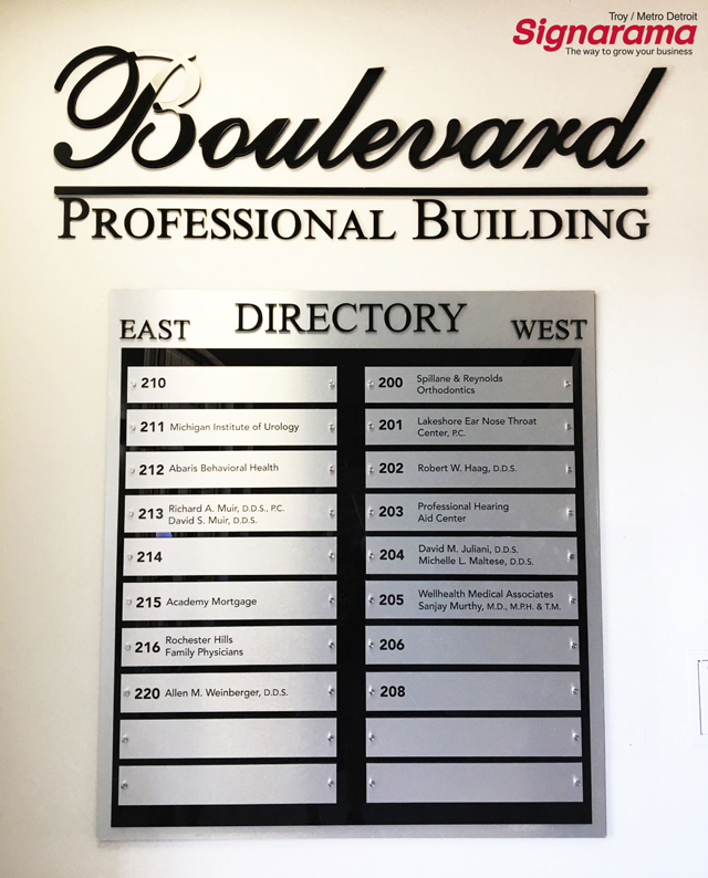
11 – Maps and directories
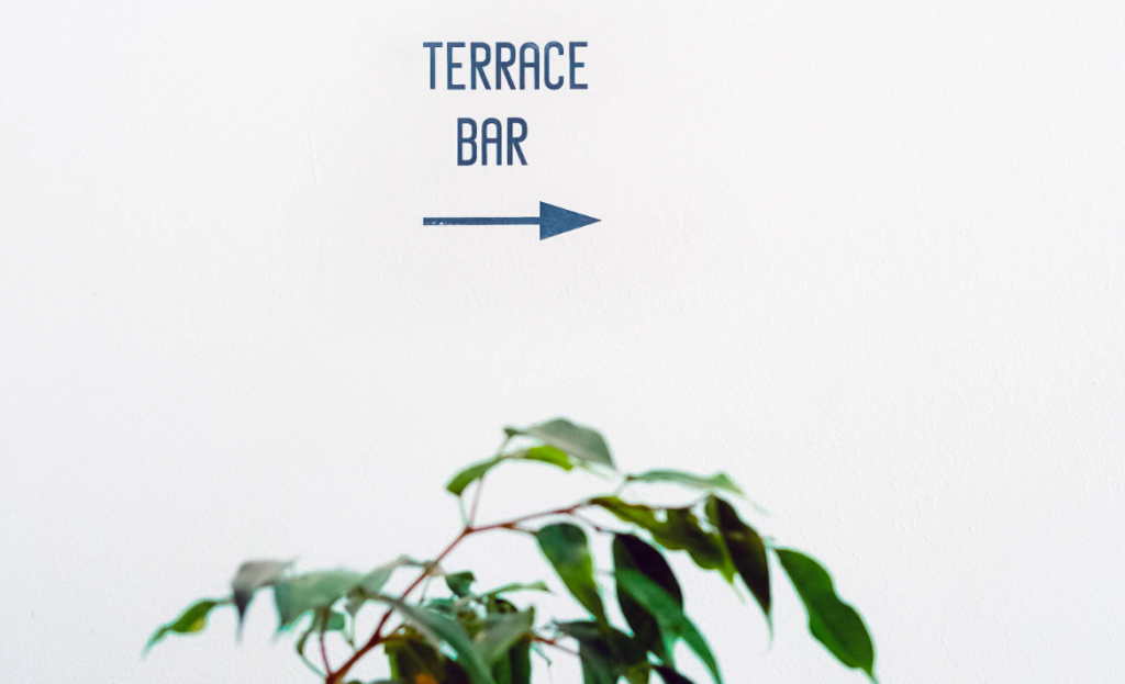
The majority of indoor directional signs are basically a nameplate with an arrow or something similar that indicates the direction. You might also give a brief info about the floor or room number. But this isn’t necessarily all you need.
In general, a map or directory of the whole building or organization is convenient. From personal experience, you probably know how much this can help you to orientate yourself.
These signs should be bigger and will obviously contain more information. However, you should still try to keep it simple. You shouldn’t need a special degree to follow them.
Luckily you won’t need as many as with the other types.
You should probably only need to mount a few in some strategic locations. Usually, you want to place one at the entrance, lobby, or reception. Excellent service means putting one in each stairwell and elevator.
Preferably, you should place at least one on each floor of a building.
12 – Give your location character
So far, directional signs can sound a bit boring. However, they don’t have to be. Not by a long stretch.
A well-designed directional sign adds to the appearance and atmosphere of your business.
Do you want customers to have a fun experience? Or do you instead want the air to be formal and elegant?
All the small details like directional signage can add to this experience. For example, a lot of companies play around with the signs right outside their restrooms. They use colors, graphics, and visual effects.
You have to find a balance between creative and interesting but still clearly legible.
13 – Visual pathways

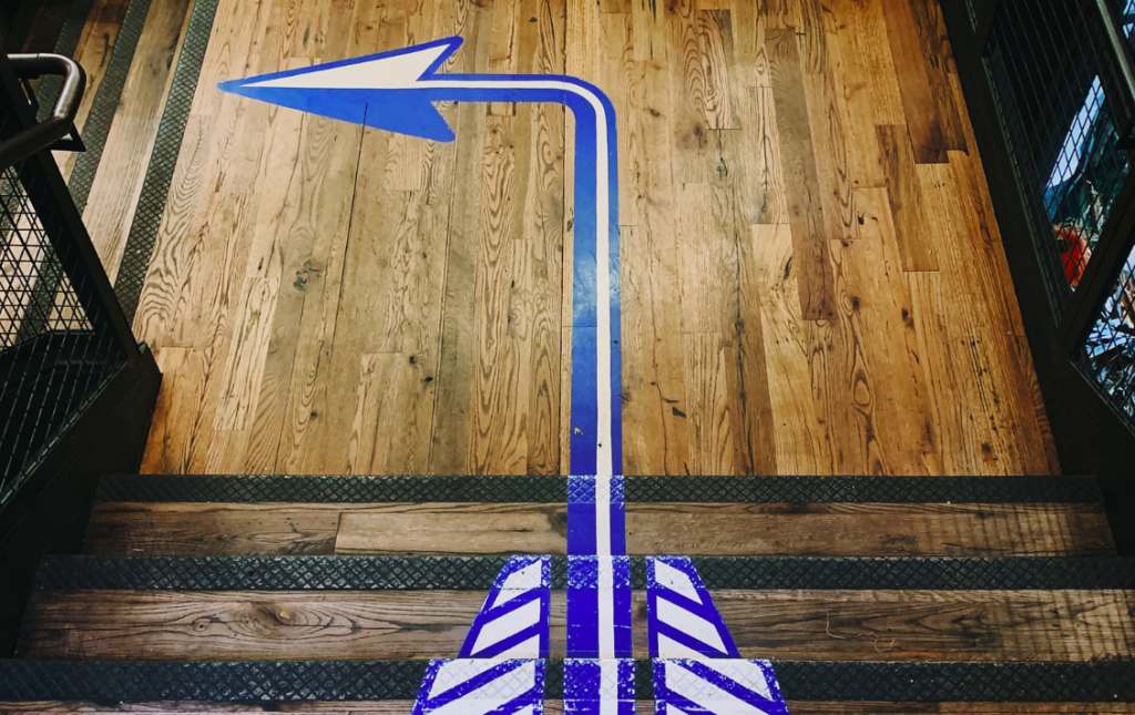
One way to really make your directional signage stand out is by creating visual paths. By this, we mean that you can use graphics to lay out the route for your customers and staff. Wall and floor graphics can be an entertaining way to do this.
You can paint arrows on the wall or the floor. Some businesses use footprints to mark out the route. Or if your organization is pet-related like a veterinary clinic, you can use tiny paws instead.
Preferably, you should combine this with more conventional mounted wayfinding signs. And use these graphics to add a new dimension.
14 – Going digital
Did you know that digital wayfinding is on the rise?
All across the board, electronic signage is becoming more popular, and it is no different here. They can be incredibly beneficial and help you to modernize your systems.
These are just a few of the benefits of digital signs:
- You can use them to create interactive maps for your customers to use.
- They will fit perfectly into an integrated wayfinding system that includes mobile applications etc.
- The software makes it quick, cheap, and effortless to update the information without replacing the sign.
- If you want to, you can use the boards for advertising as well as give directions.
One problem, however, is that they can be expensive. This is one reason that you should use it in combination with other wayfinding signs.
Fascinating signs
The world of sign making and design can be a fascinating place. There are always innovations and facts to learn about like these about indoor directional signs.
Signage is all about the experience you want to create. The importance of this will only grow as the markets become more competitive. One way to make yourself stand out is to think outside the box and make signs that are both fun and creative.


