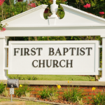
Picture this: You are in the car and are driving to a new restaurant. Your intention is to meet some friends for lunch, but you keep driving down the road where the restaurant is and cannot seem to find the place! You call you your friends and apparently you are now sitting in the right parking lot, but still can’t see the place. Finally, you find it; a place with some small banner hanging in the window; a place without a readable sign.
When you don’t have a readable sign, it’s obvious that people will not be able to find you. Then question is, what is considered a readable sign?
Text Size Improves Sign Readability
The first thing you need to make sure is that your text is done at a legible size. The general rule of thumb is that every inch of text height provides you with visibility at roughly 10 feet away. So if, you have channel letters built with 12″ letters, you should be able to read that sign from about 120′ away.
Font Choice Improves Readability
Now, text size alone will not be the only attribute of your sign that improves readability. The style of font you select can also have an impact. Thin fonts, or more decorative fonts with many flourishes, can easily cause issues when it comes to your sign. Try to use bolder fonts, when the letters cannot easily be confused.
Contrast Makes a Readable Sign
When we have clients who want very neutral, earthy tones such as a light brown on beige, we always remind them that it can affect their sign’s visibility. Sometimes, it doesn’t matter how strong someone’s font size and contrast are when the letters all blend into the background anyway. This also applies to your wall color mixed with your text color if you have channel letters.
If you feel your business may be overlooked because you don’t have a readable sign, stop on by Signarama Troy. We’ve been around for more than a decade and can help you get the sign your business needs!


