Billboards are a premium signage product. They are one of the most sought-after options, thanks to their high impact and improved visibility. However, the effectiveness of signs is heavily dependent on their design.
The content and appearance can make or break the sign. You don’t want a high-end product like billboards to fall short of their full potential. So take a look at our guide to creating a sign that will stand miles above the competition.
The process
Whenever you’re planning on creating a sign, there is a process that you should follow. Following these steps increases the chances that your boards will pack a punch and be a success. Arguably, this is even more important with high investment products like billboards.
You don’t necessarily need to work through them in a specific order. Plus, you might need to repeat some of them more than once. But you should try to complete each one at some time.
Steps
1 – First, you should do some research to make the best out of your sign. To do this, you should find out more about your target audience, competition, and advertising techniques.
2 – Second, you should also research the sign-making companies in your area. You want to get some information like quotes and then compare them to each other. Check that you’re going to get the bang for your buck.
3 – Next, you need to work out the design for the billboard. This includes deciding on the content, text formatting, images or graphics, color schemes, and more. Take your time with this step. There might be a lot of back and forth, particularly if you are consulting an expert on this.
4 – Even if you’re happy with the design, you should ask for a final proof. Images always look different once you’ve printed it. Therefore, to avoid wasting money and time later on, ask for a mock-up from your sign company.
5 – Once everything has been double-checked, you can move on with the process. Sit back and relax while the manufacturers do all the hard work.
6 – Finally, all that’s left is to do is to install the sign. You can set up some signage by yourself. But we strongly recommend that you hire the sign making company or other experts to mount a billboard. These signs are simply too heavy and large to handle without expertise and equipment.
A good story
Billboards are essentially a type of visual storytelling. You are trying to tell people more about your brand, your products, or your services. Why are you doing this?
Well, because it’s easier to remember a story than pure facts. You are aiming to make your signs memorable and have them leave an impression with your audience. The ability to do this is what often distinguishes an average sign from a fantastic one.
Don’t just list the ingredients on your pizzas on the sign. Instead, show them how delicious they are and how people enjoy eating them with their friends and families.
Overall, with billboards, you want to convey your message mainly using images. They grab attention, are easy on the eyes, and take much less time to understand. Often with billboards, the words are just the icing on the top.
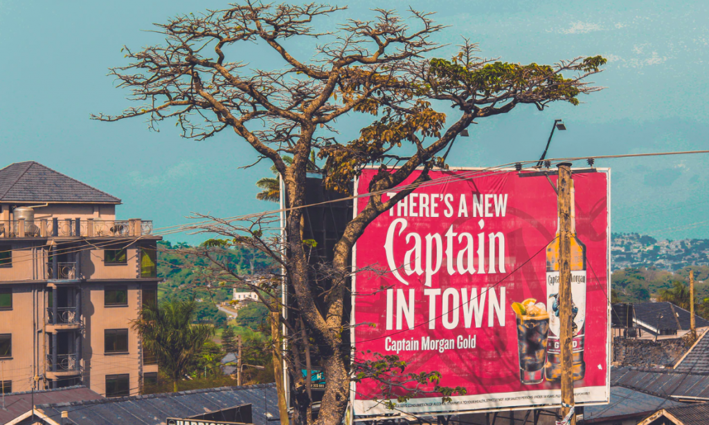
In case you want to make your sign even more impactful, try to get at people’s funny bone. If you can make people smile, they will undoubtedly be able to recall your ad better than that of your competition.
Location, location, location
Choosing a good location is crucial for any type of sign. But dare we say, it’s even more so with billboards. These products were designed specifically for outdoor advertising. In particular, sign companies produce them to place over freeways or other high traffic roads. For this reason, they are big, bold, and highly visible.
Generally, freeways are the ideal locations for billboards. Did you know that American travelers, on average, spend more than 18 hours on the road per week?
Besides this, 71% of travelers look at messages next to the roadside. These statistics are great news for anyone interested in creating a billboard.
Do a bit of research on the roads in your area or leading to your town or city. Choose a roadway that is fairly busy. Preferably, pick one that is often congested up with traffic. Luckily, there are plenty of companies that have frames to rent for billboards.
If you want to, you can even use several signs to build up some hype. Work out intervals like installing boards every five miles, reminding them of your business.
Call to action
According to this study, billboards have a significant impact on consumers’ purchasing decisions.
Three-quarters of viewers go shopping on their way home from work. And more than two-thirds decide what to buy while they drive. All these figures are quite impressive and show how influential billboards can be.
You need to take advantage of this potential impact. These signs will give you the chance to really increase your profits and sales.
One way you can do this is to include a clear call-to-action (CTA) on your signs. The phrase refers to a statement that is constructed to elicit a response from the audience. Through this, marketers are trying to convince people to act on what they’ve seen, like buying the advertised product.
Nowadays, this marketing strategy is incredibly popular for digital signs. But it can work just as well for billboards too.
Good ideas for a call-to-action on a billboard are:
- Let people know that you are on social media and encourage them to take a look.
- Give directions to your storefront, offices, or physical location.
- Ask them to call a specific number or use a specific email address.
- Direct your audience toward your website.
When you are using a CTA, you might find these tips helpful:
- Choose your words carefully
- Make sure the instructions are easy to perform
- Keep it simple and easy to understand
- Focus on trigger words
- Create a sense of urgency
- Highlight and make the CTA visible
Say it in less
One thing to always keep in mind when designing billboards is that people are going to see the signs on the go. Most of them will be driving cars on their way to work. Unfortunately, this means many viewers will only be able to spare a glance.
Ideally, you want them to understand the message on the board in 5 to 10 seconds. Typically, this will be how much time people can spend looking at the billboard.
Remember that this doesn’t mean you will have their undivided attention for that time. More likely than not, they will be looking at the road or distracted by other things along the way.
So this means you want to keep your message short, very short. Generally, you want to stick to a maximum of seven words for your main point. Don’t worry. This might sound too little. But the good news is that it forces you to be creative.
Aside from this, you will probably need to include some essential info like contact details. These don’t count towards the word limit. However, try to prioritize what you include.
If you include more content, you will only be wasting some of your time and effort. But not only that, the additional ink and colors that the manufacturers use to print it can mean more money too.
The chances are that viewers will give up trying to understand a message that is too long and complicated and look at someone else’s board that is clear and concise instead.
Play with textured and 3D elements
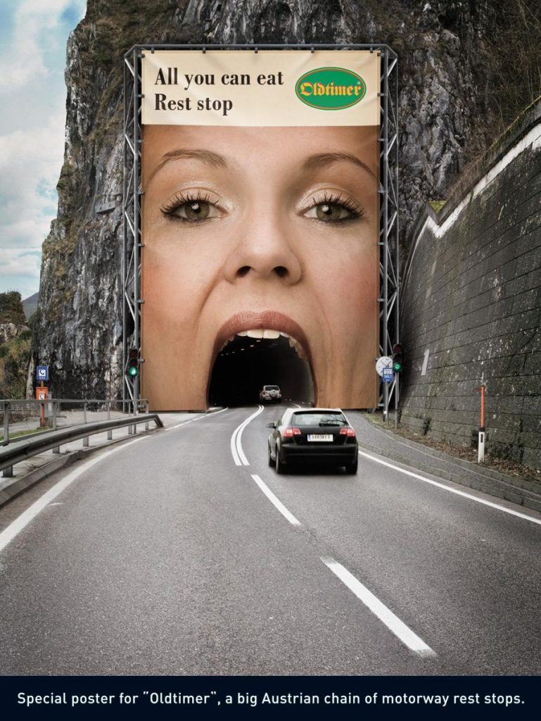
One way to make your billboard unique is to play around with textured or 3D elements on the sign. If you do this well, it’s one surefire way to create signs that are interesting, exciting, and memorable.
Due to the size, these elements typically add a touch of novelty and even humor to the design. As an example, for a construction company’s advertisement, it could be as simple as adding bricks or objects that resemble them.
It’s a good idea to use these types of features to show what your company is all about.
But you don’t necessarily have to add an actual 3D object to the design. Clever use of the environment around the sign and cutouts can create an illusion of depth that can work brilliantly.
Go big or go home
Compared to other signs, billboards are massive. The size is one factor that makes them so visible and eye-catching. There are generally three types.
Bulletins are usually 14’ x 48’ while posters are 10 ’x 22’. And junior posters are the smallest at 6’x12’.
Depending on your requirements, you can fit a few standard sheets together if you want to.
But no matter the size, you need to adjust the content to those dimensions. You can’t put teeny, tiny letters or graphics on these gigantic boards.
So if you want your billboard to hold its own against the competition, you need to go big and bold. The rule applies to both the text and images.
Here are some general guidelines for text size on billboards:
- 1 Foot letter height
- Readable at 120 ft
- It takes 1.25 seconds to decipher at 60 mph
- 2 Feet letter height
- Readable at 240 ft
- It takes 2.5 seconds to decipher at 60 mph
- 3 Feet letter height
- Readable at 360 ft
- It takes 4 seconds to decipher at 60 mph
- 4 Feet letter height
- Readable at 480 ft
- It takes 5.25 seconds to decipher at 60 mph
Avoid using several small images on the sign. Instead, pick one sizeable primary picture for the design. Not everyone uses images for billboards and people can create striking boards using only text. But a well-chosen image can take the sign that extra mile.
Just remember that the resolution needs to be pretty high for images of these dimensions.
Light show
Visibility is always a critical factor in sign design. Because billboards are typically placed next to the roadside, people will drive by it at all times of the day and night.
You need to make sure that there are already lights mounted on the frame for the board. Or else make sure that you install suitable lighting. Usually, people fit them so that they protrude overhead or underneath the sign so that the whole sign is illuminated.
Lights won’t just make your signs easier to see. They can make your sign more appealing too. For instance, if advertising a car, you might mount LEDs where the headlights would be. So there are opportunities to get creative with this.
Embrace color
Similarly to other kinds of signs, the use of color is a critical component of the design. Effective use of colors can be a brilliant way to get your billboard to stand out.
There are two main routes you can go.
First, you can use a very bright and colorful palette. Generally, doing this will make your billboard stand out from its surroundings. Many of these bright colors are inherently appealing to most people like a bright blue or green.
But as with other types of signs, you don’t want to use too many different shades lest it might turn your design into a bit of a mess. Instead, pick two to five colors that will be the main ones.
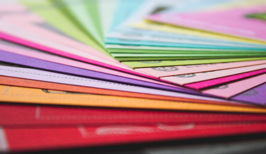
Alternatively, you can use more muted shades as long as you use contrast well. The colors should stand out from one another without clashing like black on white.
Whatever palette you decide to go with, always keep the colors for your branding in mind. Plus, consider how the colors could affect the mood of your viewers and how they interpret the sign. For instance, people often associate yellow with summer and feelings of happiness.
Don’t be afraid to be unique
Whenever you’re creating media for your business, focus on your brand and identity. You need to bring that across. But you should also keep contemporaries at the back of your mind. Competition is often stiff, and advertising is a vital strategy to hold your head above water.
As you can see with billboards, you must brag about the features that make your company unique. By showcasing this, you can add some creative sparks to your signage.


