Signs are a way to attract attention to your company, item, or idea. You have something you want to share with others, and putting it out there for them to see it is one way to do that. Today, we want to share some sign inspiration. Seeing what others have done might get your own creative juices flowing to harness the power of signs to reach your audience. Here are three signs that merit taking a look at.
Sign #1 – Irish Hills Fireworks billboard
Why we like it: You can call this billboard (5th in slideshow) by Adams Outdoor explosive advertising. When your client is a fireworks company, what makes more sense than capturing the eye-catching aftermath of a detonation? Plus, if you want to crack up passersby as they catch sight of your ad, this could be a great way. It’s unexpected—yet apropos.
Sign #2 – Go! Sy Thai logo
Why we like it: This logo may be small but it packs a powerful punch. What’s not to love about the upbeat “go!” on a simple circle? We really love the white type on a green circle as seen on their Go! Sy Thai food truck. But the on-wall logo captured by Eater Detroit is also striking.
Sign #3 – Townhouse restaurant entrance sign
Why we like it: Here’s a sign that’s striking, but not overblown. It has a vintage feel, almost reminiscent of an old movie theater. Plus, it incorporates warmth and light, but it’s not so glitzy that it totally undermines the urban classiness.
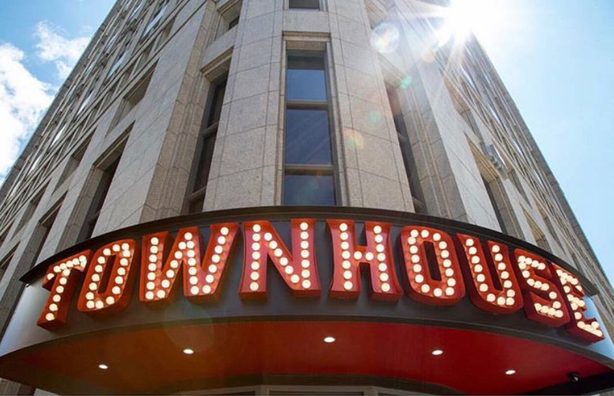
eatattownhouse. “Townhouse 🗝 + Tacos 🌮 = 🙌🎉💯”. Instagram, photographed by
bedrockdetroit, September 27, 2017, www.instagram.com/p/BZhH0e1nfAT/.
Bonus sign
Even though this one wasn’t in Detroit, but rather in Grand Rapids, it deserves a mention. VizCom Media’s banner for ArtPrize.org was a great one. The white text on a blue field is simple, yet provides good contrast. Plus, the splashes of color on a white field are delightfully whimsical.
It’s more than just what you say
When you have something important to say, there’s more than one way to get the point across. Actually, this is similar to the way it is with spoken language. When you say something, you’re communication with more than just your words. There’s also your tone of voice and your facial expressions.
For example, think of how many different ways there are to say the simple phrase, “I know.” Without adding or deleting words, you can communicate, excitement, disappointment, frustration, and other emotions. How? By using your face and your voice.
Do it with design
Similarly, the words you use in your signs aren’t the only things that “speak” to your audience. You can also use the design of your sign. There are several elements of design that can help you communicate your message. You can use colors, fonts, shapes, and size to name some possible elements.
For instance, one of the things we liked about the Go! Sy Thai logo is the circle. As we said above, it’s striking. Plus, when you combine it with the white and green, the effect is energetic and punchy.
Then, there’s the fireworks billboard. Remember how that billboard looked like it was blown away? That’s a great example of how you don’t need text to get your point across. Ironically, it was the absence of text that drove the advertising home.
And the illumination of the Townhouse restaurant sign is part of what makes it stand out. Yes, it had letters. But it also had lights—proof that words aren’t the only element of design that “speaks.”
Note what not to do
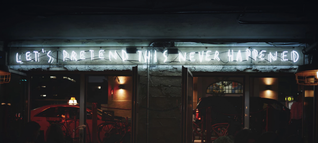
The signs we’ve been looking at have been instructive in a good way. But, keep in mind you can actually learn from poor signage too. Even an ill-conceived sign may have a thing or two to teach you—about what to avoid and why. If a sign is memorable to viewers for the wrong reasons, learn from it what not to do yourself when it comes to your signs.
Location and size
And remember to think about how well people will be able to take in your sign. If your sign is a billboard that motorists will be passing quickly, keep that in mind during the design phase. Make sure people will be able to see what you want them to see in the amount of time they have while driving by.
Moreover, if your restaurant entrance sign is so small that customers can’t find it, you might be doing yourself a disservice. Make it visible so that your customers won’t have trouble finding you, and give up in favor of another nearby restaurant with more prominent signage.
Learn from everybody else
Even if you already know what you want a sign to do—share a certain message—you still may not know exactly how you want to do it. Looking at the signs others have deployed can help you get a better feel for what you should do. And for more help creating good signs, check out Tips And Tricks To Creating The Most Effective Signs For Marketing.

